

You must log in or # to comment.
Really nice icons! I wish we could change the default one, the app is really good but I’m not really fond of the icon.
They will add custom icons for sure soon.
I get that they’ll do it soon. But I wish that would be fixed ASAP. The original one was at least better than that new one which is the worst I’ve ever seen on an app this good.
Yeah I’m sure it’ll happen in time! The devs are working at a crazy pace getting the important stuff figured out first
deleted by creator
Cute
Thanks!
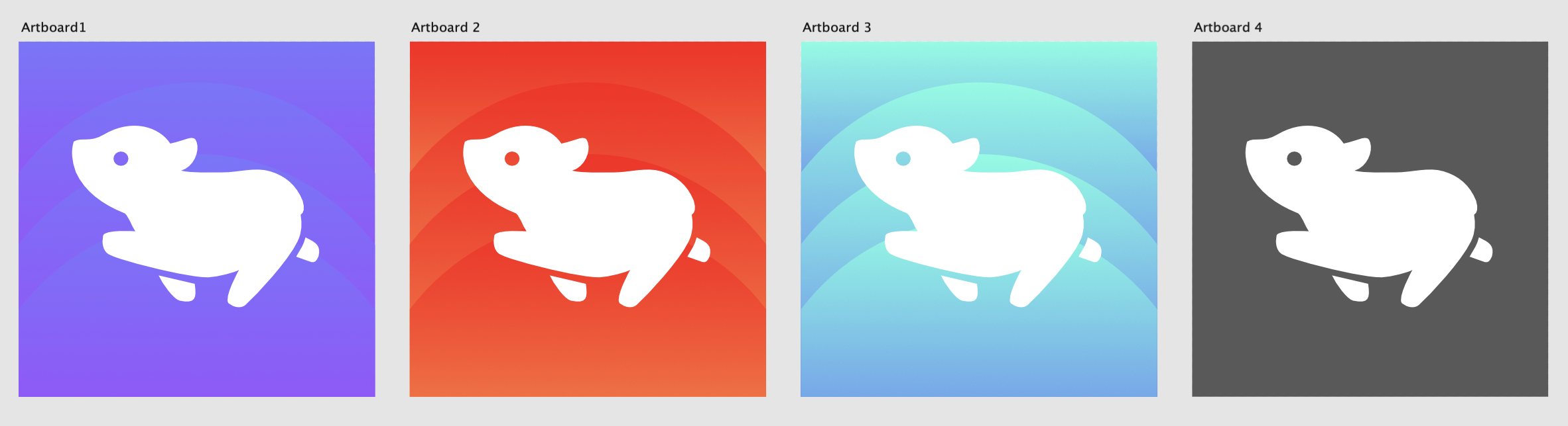
Cute but at first I thought they were little pigs…
I like the concept but the leg sticking out the back at that angle looks a bit too much like its pooping
Haha well maybe it is pooping!
Very nice, I vote for 1 or 2!
I vote red
These are great!
Nice! I like the waveform effects in the third one. It would be cool if users could choose from several icons the way that I can do that with the IceCubes app for Mastodon
This one is easily the winner from what I’ve seen so far, first that really feels unique and would stand out in my home screen, in a good way. Nice job OP!
Thanks!
So cute! One thing that I noticed though, is that the lemming’s front and back legs on each side of its body are moving together (both of its left legs are moving forward in the graphic, and both right legs are moving back). In nature, they run with the front/back legs of opposite sides moving together.
I think I’m explaining this very poorly, but as an analogy; think about how people normally swing their arms while walking. Left arm forward with right foot forward, right arm forward with left foot forward. It’s the same idea with the lemming.
Another one that’s just my opinion - decreasing the amount of negative space between the lemmings body and right legs. The legs are just so small that they end up looking like just little nubbins. I thought the back leg was a tail at first glance.
(P.S. I really do like the design! I just have an obnoxious eye for detail. My comments are only intended to help your icon be as lovely as possible.)
I’m sorry, this lemming is actually rehearsing for a ballet performance and doesn’t succumb to the peer pressure of moving like your run-of-the-mill lemming /s
In all seriousness, I get what you mean but animals all have several gaits, some of which have both limbs on one side moving in unison (e.g. when dogs amble or pace)
As for the negative space, I had a hard time with it but I’ll try to refine it as someone else also said the back leg looks like a poop!
Thanks for the feedback!


