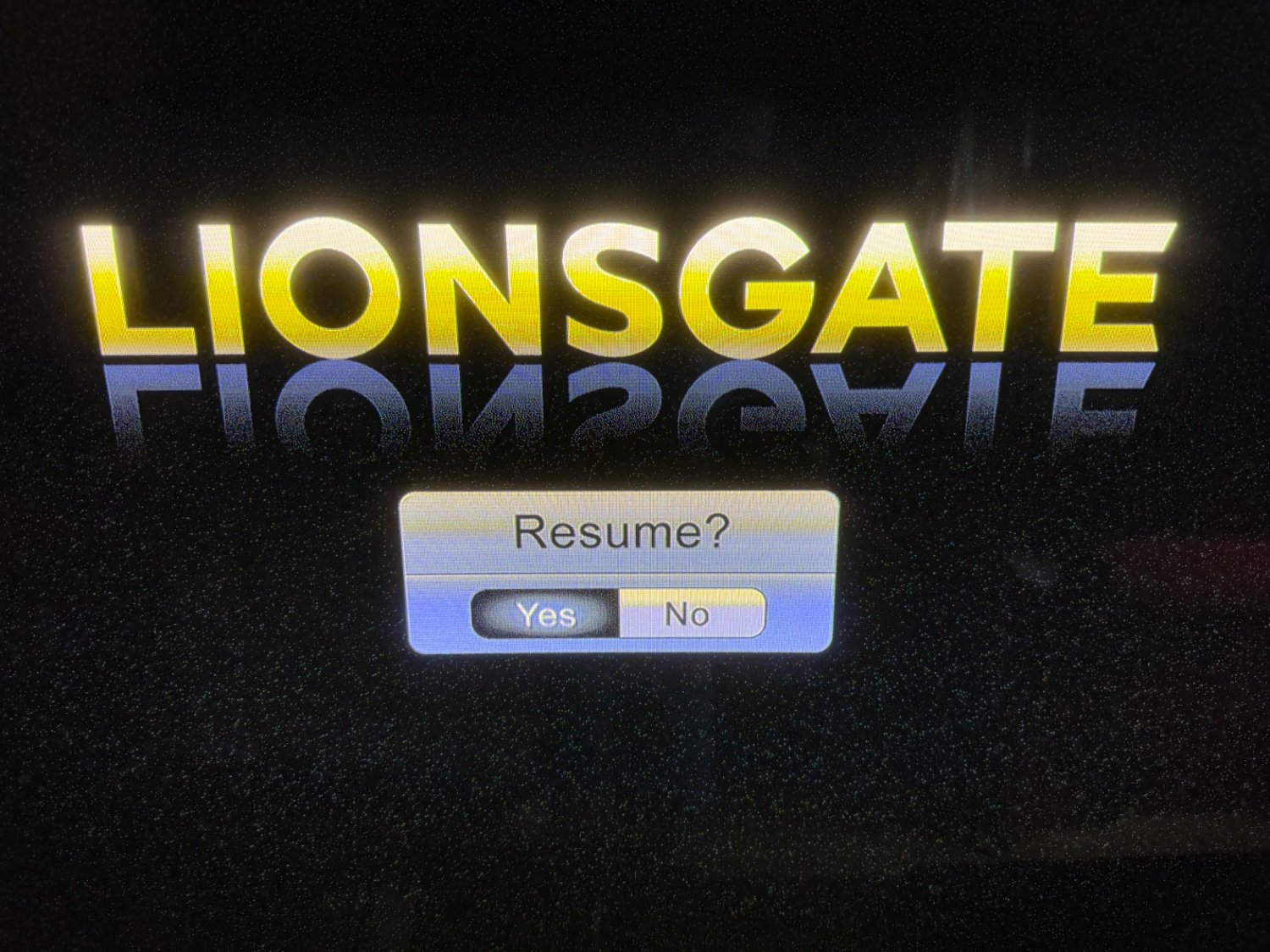
I think we need to know what the UI looks like before a selection has been made, or what it looks like when the curser is over each option. The ‘interface’ part is lost by a single screen shot.
When you’re not using a pointer interface (mouse or, awkwardly, wii-mote) it’s extremely rare for the UI to ever be in a neutral (nothing selected) state. Since you’d always be navigating relatively (go right, down, up, or left) instead of absolutely (go to pixel 753x1034) there always must be some point of reference for that movement.
Once in a blue moon you’ll see a menu where your initial selected position is something like “before the first item” so when you press right in a horizontal selector you actually move from nothing selected to the first thing selected and it’s almost always a terrible UX. If you set up such an interface you’re accepting that every action will require an extra useless click and that users entering the state freshly (i.e. you reach this screen then walk away and your partner is the next person to see it) will be confused about where in the action they are. You’re also accepting responsibility for what will happen if the user confirms without ever actually making a selection which will usually require some (again, utterly unnecessary) dialog box asking the user to try again but this time actually select an action.
Relative navigation having a neutral/unselected state is almost always a mistake.
No selection was made by me. It showed up with one of them being white and one being black. Can’t remember which side was which. But keep pressing left on the remote and they just cycle back and forth. This is on a bluray player.