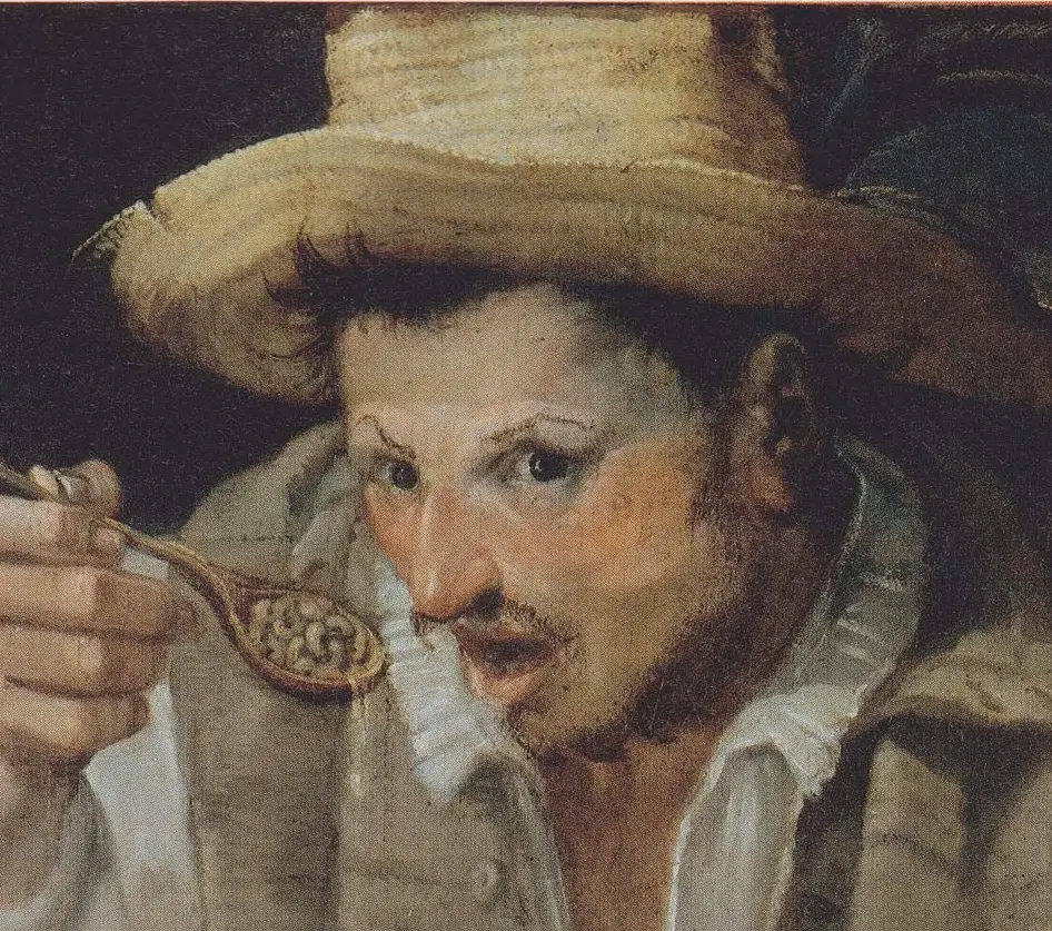
I hate this picture so much I can hardly look at it, which is why I love it. Most horror paintings rely on darkness and the viewers’ imagination. This one is in the bright daylight.
The oblique angle, the off-centering, and the way figures are positioned behind one another, all lend to the creepyness.


The lighting is an interesting detail. take the nude figure for instance. Her breasts give shadows as if the light were coming from directly above, but then her face gives shadow as if the light were to the side. The hands on the figure on the right- whose are they? My first impression was that the left hand at least was the same figure, but any of those hands could be any of those three figures’.
burn it with fire, i hate it.