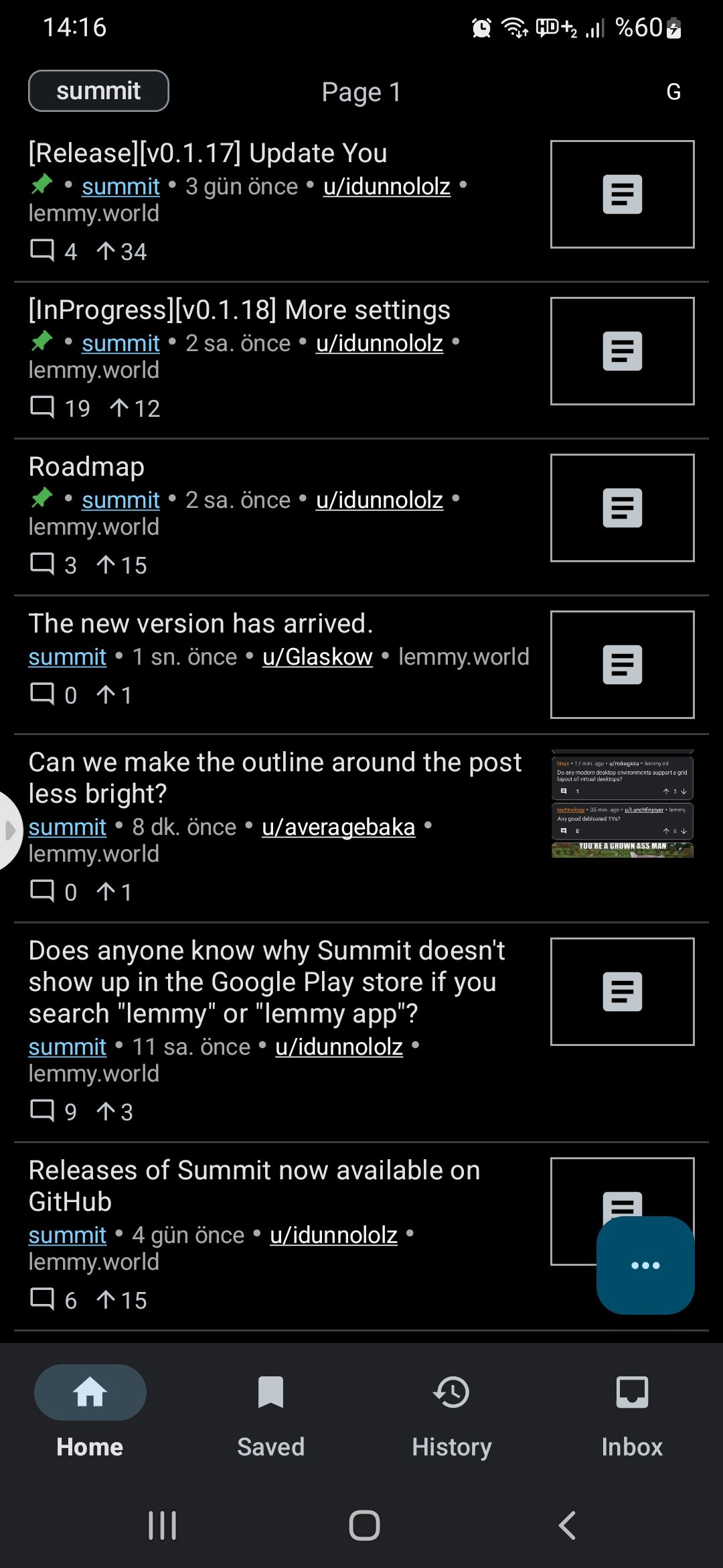
The new version is very nice. Now we have the inbox.

You must log in or # to comment.
Looks super clean! Feel like the title text should have a few more pixels of padding between itself and the divider line (looks a little cramped, even for a compact mode)
Thank you for the feedback. I’ll add a bit more padding. The release is technically only available for beta users at the time being because I wasn’t sure about a particular decision about inbox.
Thank YOU for responding! Great work on the app so far :) it’s been really cool to see so many developers working on lemmy clients the last few weeks!


