Hey folks! 🏄♂️
First things first:
I have been absolutely floored at the positive response you all have had for Lemon! I frankly did not anticipate so much support and positivity. I want to thank each and every one of you for that!
second things… er… second:
Apologies I’ve been slow to update you all! I want to be clear: Lemon is not dead, and is very much still in active development!
I had a very hectic past couple of weeks in my personal/professional life, and so I haven’t had as much time to dedicate to Lemon as I would have liked. Combined with the 4th of July holiday here in the US and some other travel I had planned, my free time was limited. But fear not! We are rapidly approaching a testflight release for iOS! 🎉
What features are currently working for 🍋 ?
Right now, I have:
- signing in with instance search
- light and dark modes
- upvoting / downvoting / saving / commenting
- rendering post feeds, comment threads
- collapsing posts, comment threads
- in-app browser (ie for links, media)
- native image / gallery viewer
- community search bar
- comment / post sorting
- basic account / community / instance filtering (WIP)
What about the other things you said in DevLog[0]? >:(
Yes! So I ended up removing account registration and offline persistent cache for now. These features will both return, but I wasn’t happy with some of the bugs. Just about any engineer will tell you that there are two hard problems in CS: naming things, and cache invalidation. I personally think there’s more hard things than that, but needless to say, I want to make sure I get these pieces right before shipping them to you all!
Can we see 🍋 ?
Certainly! And since I made you all wait so long and you all were so patient while I got my 🍋’s together, I’ve recorded a small video!
Videos
apologies these are on youtube and not the fediverse, I don’t have a peertube account yet :)
Photos

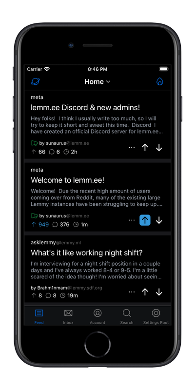
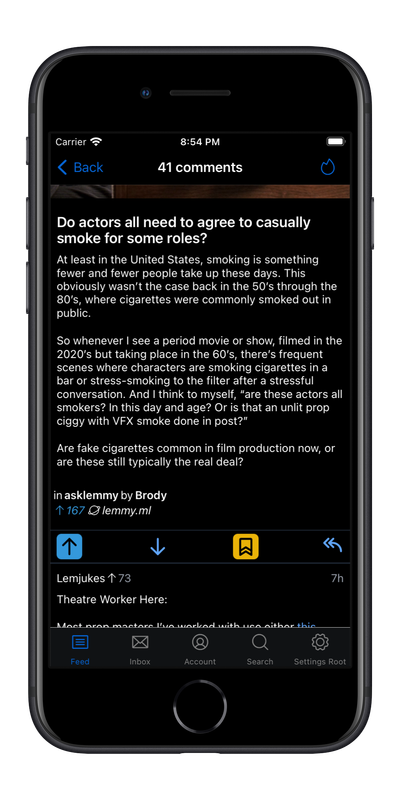
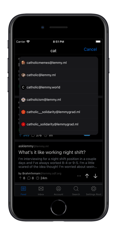
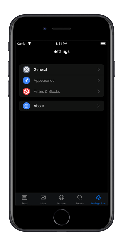

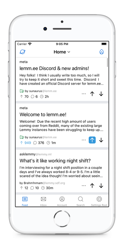
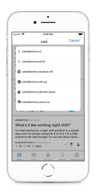
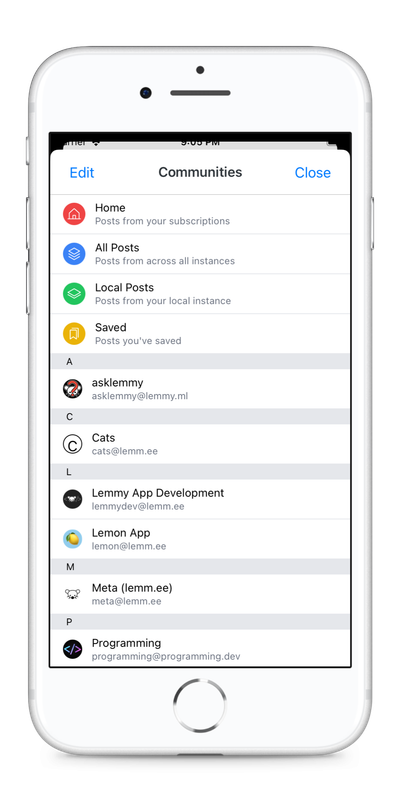
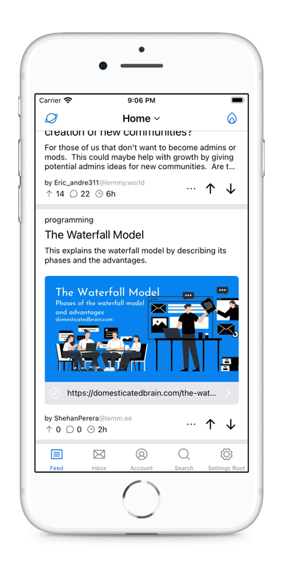
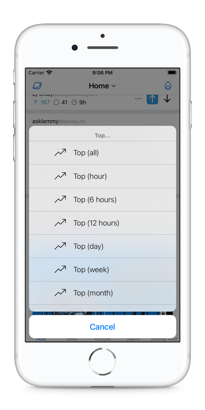
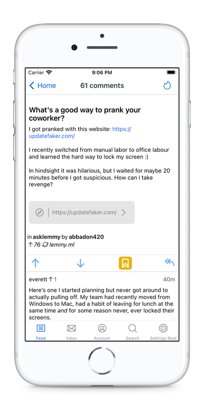
Any questions? Thread them below!
Love and lemons ❤️ 🍋


I think your goal is emulating Apollo is a good one. It’s more than just looks though, it’s a lot of 1-handed action too, tapping down to the next comment, swiping back to previews views, lots of themes (not just black and white, but other “dark, but not black or grey” themes like dark navy blue). And never forget the easy way to vote, save, etc. again, one handed.
Totally agree! I’m hoping to make it a solid one-hand-use experience.
For themes, we’re only going to have light and dark to start with. But eventually I do want to support user customizable themes. Just something on the roadmap for later.