I think flat design makes sense for logos too, for the exact same reason it makes sense for icons. Flat logos are easier to recognize and see, especially from far away.
I’m not saying this logo great or anything but I don’t think it’s fair to claim that everyone using flat design is just a trend chaser.
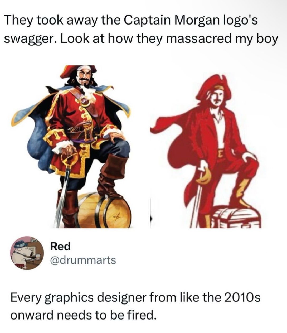
I never claimed they were all trend chasers - my point was that it had a good place and then trend chasers over did it, and those areas are problematic. There is a place for it where I think it deserves to stay, but people have used it in the wrong places and overdone it in others to the point where the overuse had started showing issues.


I think flat design makes sense for logos too, for the exact same reason it makes sense for icons. Flat logos are easier to recognize and see, especially from far away.
I’m not saying this logo great or anything but I don’t think it’s fair to claim that everyone using flat design is just a trend chaser.
I never claimed they were all trend chasers - my point was that it had a good place and then trend chasers over did it, and those areas are problematic. There is a place for it where I think it deserves to stay, but people have used it in the wrong places and overdone it in others to the point where the overuse had started showing issues.