erik111189@lemmy.world to Optimists Unite@reddthat.comEnglish · 10 months agoDown and to right?lemmy.worldimagemessage-square13fedilinkarrow-up1150arrow-down117file-text
arrow-up1133arrow-down1imageDown and to right?lemmy.worlderik111189@lemmy.world to Optimists Unite@reddthat.comEnglish · 10 months agomessage-square13fedilinkfile-text
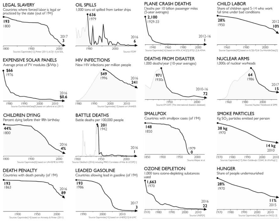
minus-squareLeafOnTheWind@lemmy.worldlinkfedilinkEnglisharrow-up2·10 months agoHis argument is bad, but that graph is too. It should have started at a later year for a better comparison.
His argument is bad, but that graph is too. It should have started at a later year for a better comparison.