
- cross-posted to:
- xkcd@lemmy.world
- mapporn@lemmy.world
- cross-posted to:
- xkcd@lemmy.world
- mapporn@lemmy.world
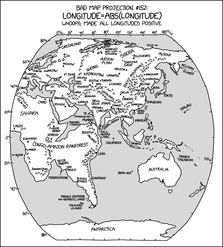
https://xkcd.com/2807 I like how the Titanic ended up in the Caspian Sea
You must log in or register to comment.
As an Australian, it took way longer than I care to admit before realizing what is going on there.
So Columbus was right all along, he just made an error in the sign.
I like this better than the real map. I will start a conspiracy that claims this map is the real one and the government is just hiding this from you. Aircraft don’t fly over the Atlantic ocean from Europe to the Americas, they actually fly around Africa. WAKE UP SHEEPLE.
WAKE UP SHEEPLE
God what have you done??!!
So you can use any function in that map. How about log, cos, sqrt or something else. Should be fun.
The Mercator projection is kinda already using cos, which the maps looks so different from a globe at the poles.
But yeah, there’s bound to be some other fun ones, lat = abs(lat) being the obvious other one to try, but maybe an anti-mercator could be fun.
Normally we’re projecting a sphere on to a cylinder, cone or some fancy polyhedron. Now what if we picked a more interesting shape such as a disc, cube, saddle, donut or a banana and project on to that instead. Is there a shape that maximizes distortions in all latitude and longitudes…
I guess showing the higher of the two (so doing
east ∧ abs(west)), but it’d be interesting to add them together (east + abs(west)) and see what happened to all the mountains. Maybe if the sea level changes we’d get new islands entirely.

