

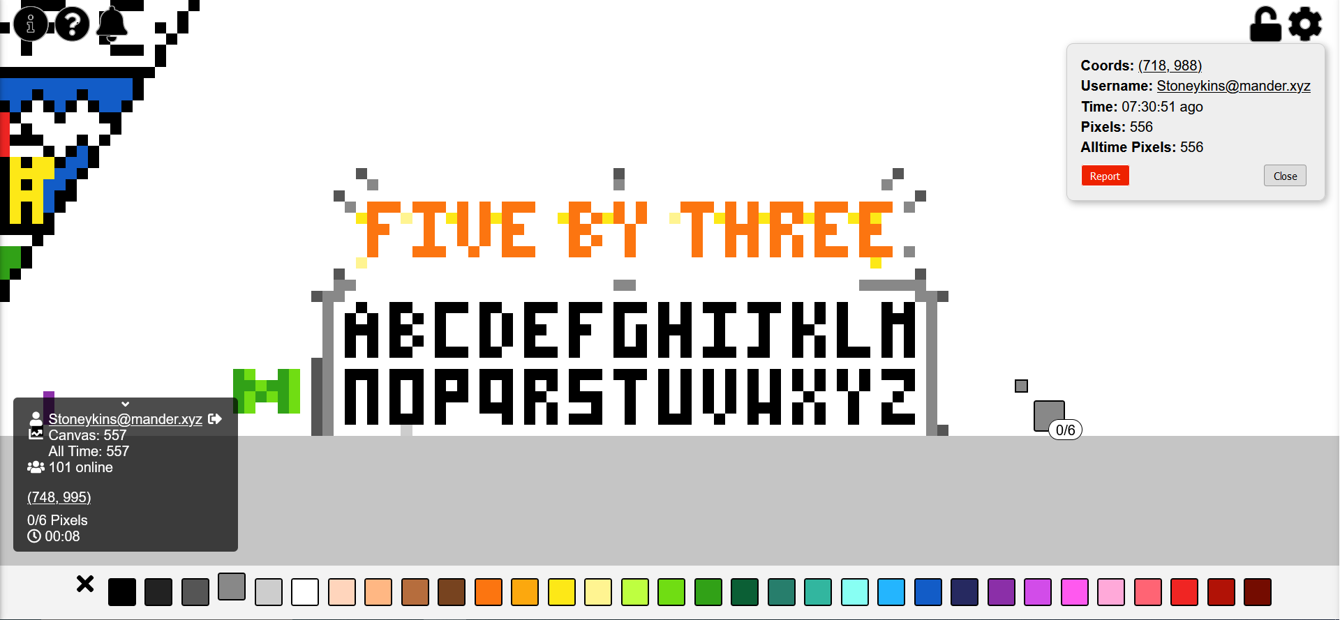
I’ve been doing this. Now everyone will know the superior small block letter font in which every letter fits into 5 by 3 pixels. I challenge you to show me a better small block letter font in which every letter fits into 5 by 3 pixels!
also I’m still trying to make it look nicer but it was taking a while so I figured I should explain why I made this
shoutout to mvirts@lemmy.world I like your green M
update: not done yet, but I wanted to ask people’s opinions on the J. any consensus on which is better?

Just spotted this, which I quite like - the person doing it is using 4x3, which still works, although it does mean the M and H are the same, and no space at the top of E or F