It’s pretty easy to spot dark patterns when you look out for them, but I found a pretty obvious example of this.
Stoofie is a brand that sells water fountains for your pet (I don’t know what the problem with a water bowl is, but I digress). WayBack Machine
Plastered at the top of their website is “33% OFF Ends Today- Free Shipping” with no way to dismiss it. There is a scrolling text under the main image “FAST AND FREE SHIPPING 60-DAY FREE RETURNS”
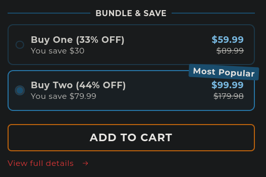
If you scroll down, you’re immediately introduced with a product with the option to buy two preselected. The rest of this section explains itself:

Other things are sprinkled in the main page, but it really is the prime example of dark patterns. I am personally sick of finding them, but would love to see more examples of what others have found. Please, share your favorite examples of dark patterns. Don’t forget to archive them first so they can never be lived down.


The difference in selection is very real. If you need to buy one of those once in a lifetime things, you’ll probably find those in Amazon. The local stores have no incentive to keep those in stock, because they will probably only sell less than ten of those things within the next 20 years.
However, when it comes to phone chargers, towels, garbage bags or soap, my local store is perfectly fine by me. I don’t even know how much cheaper those things would be on Amazon, but I prefer to keep the local stores around. If I happen to need a very specific kind of charger with some special features, I’ll just see if there’s an online store for that sort of stuff. Usually there is and it’s also within a 1000 km radius of where I live. Sure, shipping usually takes a few days, but I’m in no hurry.