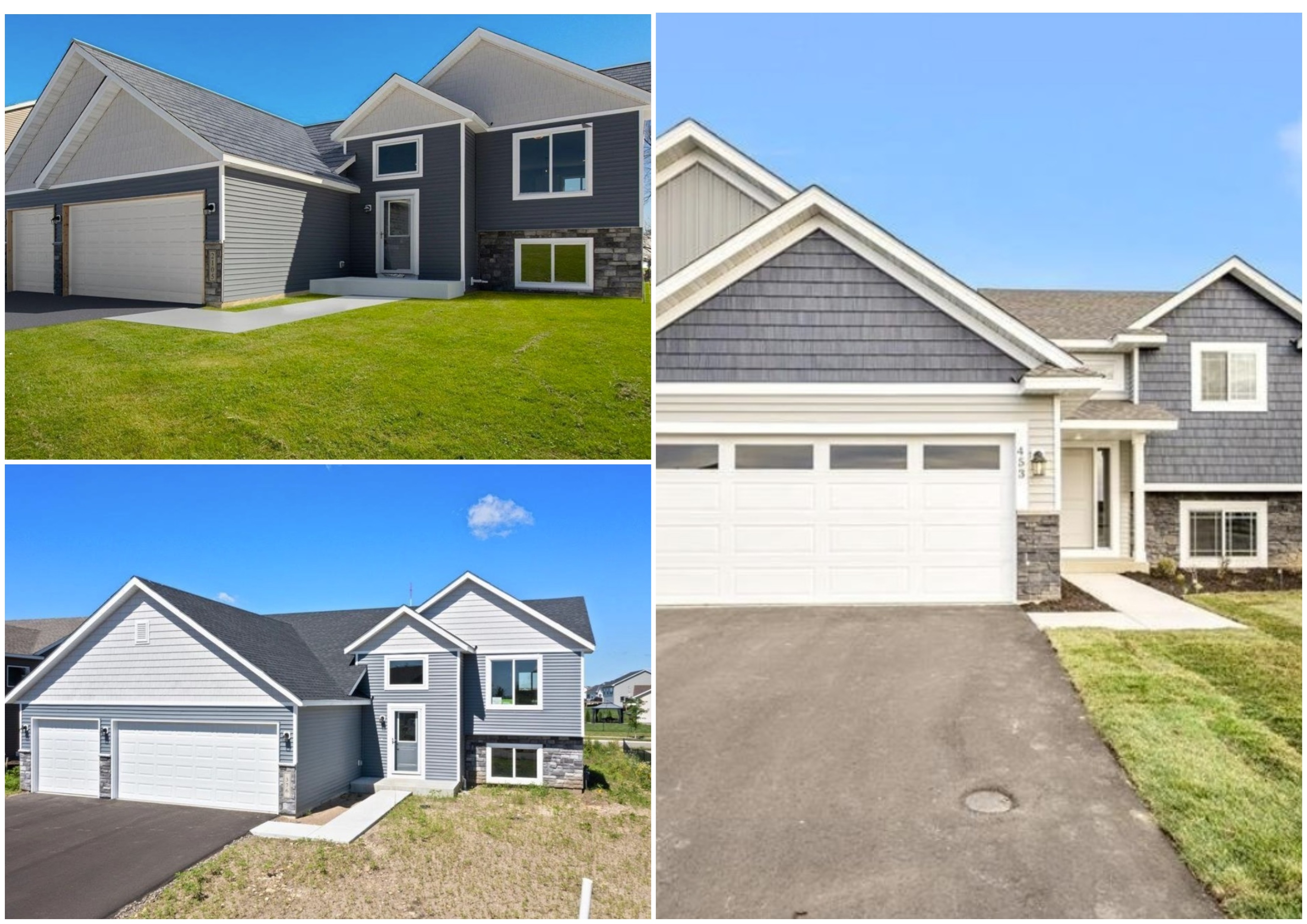
Architecturally, Racket has railed against contemporary fast-food design and contemporary commercial design, all while praising urban century homes. Now we enter a much thornier realm: the aesthetics of the modern suburban home.
Thornier because our outlet champions Minnesota’s increasingly diverse suburbs and also because, well, this sort of indictment is directed at the tastes of individual consumers rather than corporations—the ol’ punch up vs. punch down dilemma. But maybe we can let the new-build homeowner off the hook, at least a little bit.
“Developers think they know what people want, and what the people want is what sells,” says John Archer, a retired architectural historian at the University of Minnesota. “So if they put up a bunch of these and they sell, they figure that’s what people want. If you’re working from a particular template, you’re going to say, ‘Oh, that worked, let’s do some more.’"
(Making salesmanship easier for developers: U.S. homebuilders are still clawing their way out of a housing crisis that has demand near all-times highs.)
That’s the sort of development that caught the eye of Sean Hayford Oleary, a web developer and member of the Richfield City Council. “Unlike boxy, nondescript apartments, single-family homes meet the unique style and preferences of their owner-occupants,” he recently tweeted, directing followers to four nearly identical $450K-ish new homes for sale in rural Dundas, Minnesota. The sameness of the homes jumped out, he says, adding that there’s nothing particularly novel about that observation (more on that later). Rather, his critique stems from what appears to be the prevailing style of new single-family constructions—“snout houses,” as Archer calls them.
“The real thing that made me want to needle those particular listings is how car-centric the design is,” says Hayford Oleary, a bike lover and “transportation geek.” “The front yard is basically half parking lot, and you can barely see the part of the house where humans live. People will argue that cars are just part of modern life, and that’s true, but just because they’re the main way people get around doesn’t mean they need to be the main architectural feature of new homes.”
Architectural critic, author, and journalist Larry Millett didn’t have much to add to Hayford Oleary’s Twitter criticism, saying that new suburban homes “don’t really offer much in the way of style” outside of those at the tippy-top of the market. “In the garage-forward design that’s most common today, the house itself reads essentially as an appendage to the garage, with the main rooms usually facing the back,” he says.
To Archer, the rears of these homes are just as head-scratching as the fronts.
“Frankly, if I were to say, 'What is the suburban stereotype?’ It’s where a developer comes in on a tract of land, they bulldoze all the trees, reshape the terrain into hills or berms,” he says. “You’ve got basement walkouts, you’ve got formal front entrances. It’s very strange. You drive by the house, and the front gets attention; the ugly backside is completely utilitarian and that’s what faces the highway—it seems incongruous to me.”
But my attempts to have experts tee off on modern home design proved mostly unfruitful. As Hayford Oleary noted, cookie-cutter crops of suburban housing stock have long been remarked upon. Archer says the post-war mass production of housing baited critics right off the bat. Folk singer-songwriter and activist Malvina Reynolds penned perhaps the most famous example in 1963 with “Little Boxes,” her critique of the monotonous, “ticky-tacky" developments in Daly City, California. "That critique goes back, well, forever. There’s a whole raft of popular music critiquing that same thing; there’s McMansion Hell,” Archer says. (Click here to read Racket’s conversation with McMansion Hell creator Kate Wager, who’s now architecture critic for The Nation.)
“A good deal of my writing actually argues that the critique of suburbia is misguided,” Archer continues. “It becomes this delicate balancing game: OK, these are people’s aspirations, and I may not think they are to my taste, but why am I better than them in condemning their tastes? I can’t legislate [my tastes] or, you know, force that on them. The argument becomes circular.”
Adds Millett:
“Since the bungalow era ended in the 1920s, everyday middle-class homes have been pretty simple stuff. Nothing wrong with that, I guess, but it’s rare to find any interesting design in today’s subdivisions.”


We’ve gotten much better at mass producing houses, but then they look like mass produced houses. New building supplies and methods are very fast to assemble and produce houses that are more energy efficient but without the labor and craftsmanship they are plane, square, and without craftsmanship. My century house with plaster walls and wooden siding and trim is not particularly ornate but there is a sense of craftsmanship. I have learned through repairs that maintaining this aesthetic is a LOT of work but the results look better than modern assembly methods.