
Some real beautiful data graphs in this paper
Source: https://doi.org/10.1016/S0140-6736(24)02317-1
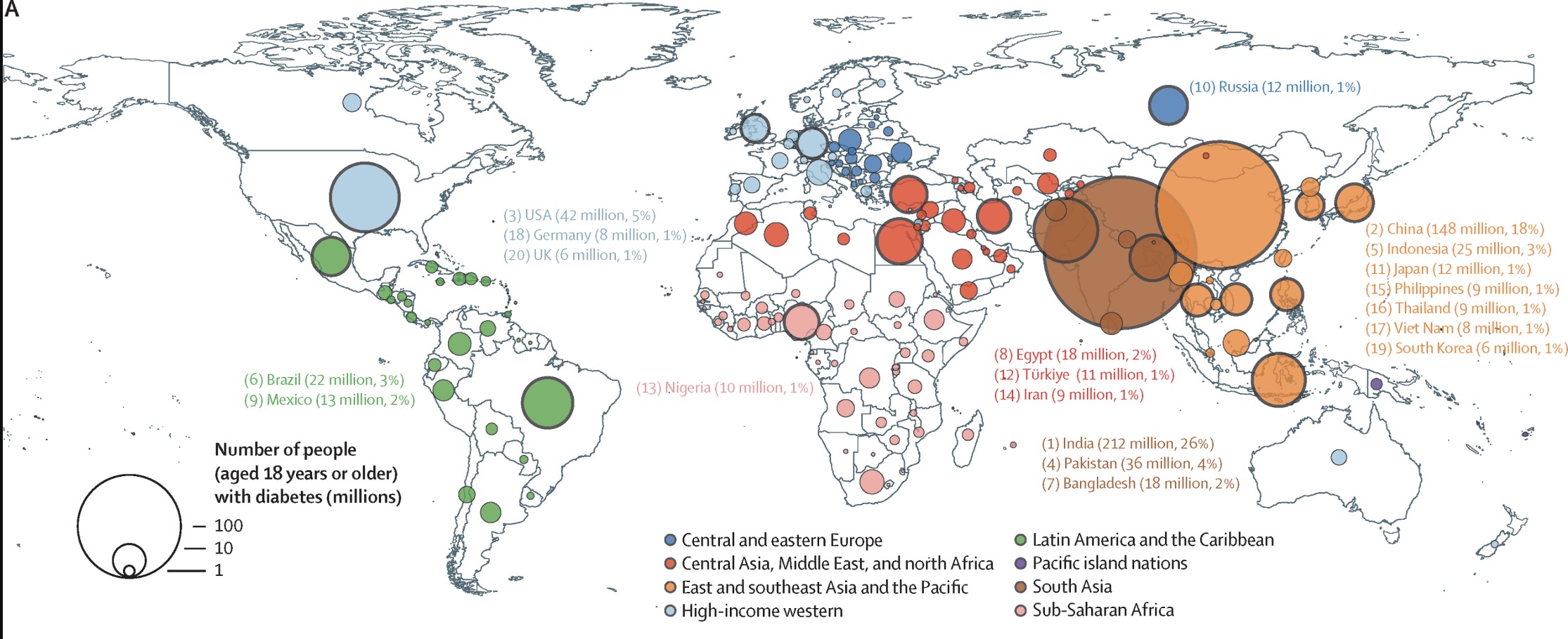
The Top 4 Countries by rate:
- India 26%
- China 18%
- USA 5%
- Pakistan 4%
This is only accounting for tracked diabetes, so some of the areas might have larger numbers.
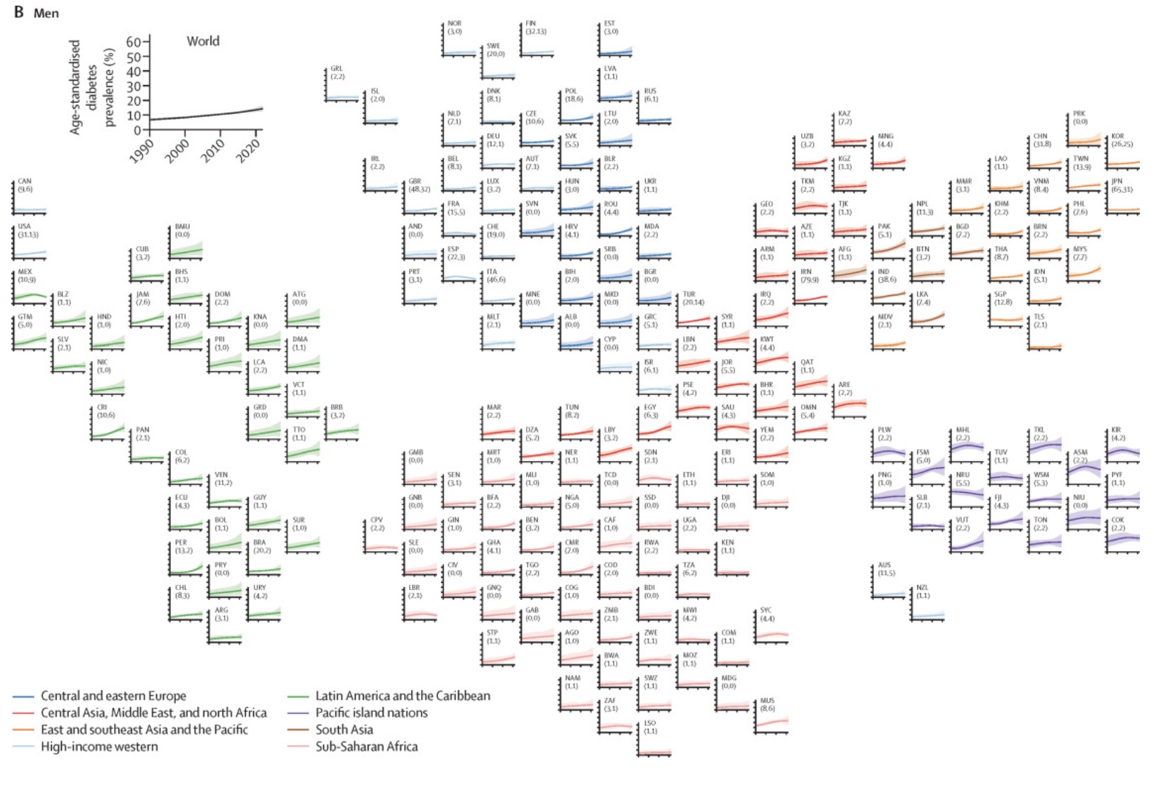
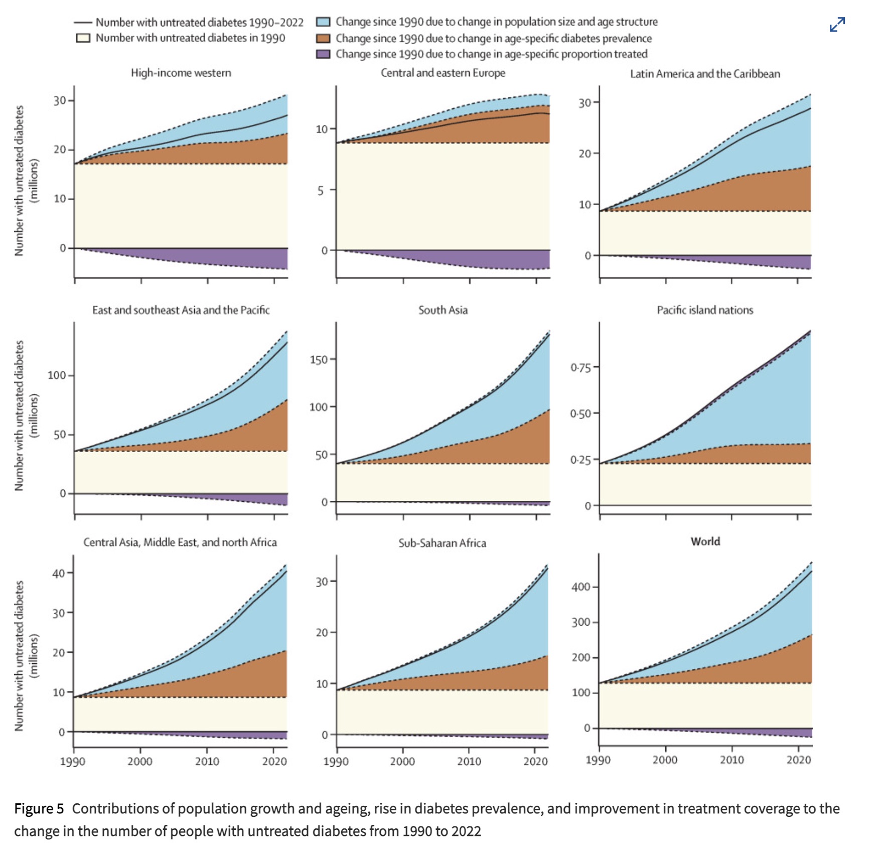
It’s a shame these graphs - all the graphs in the paper - report number of people and not rate. Makes it yet another population map, although the exponential growth of untreated diabetes in Americas and Asia is a pretty stark contrast to Europe, even without normalization.
The graph is sorted by percentage
https://hackertalks.com/pictrs/image/68f9d752-29df-4be5-b085-0ddb3b55cc01.jpeg