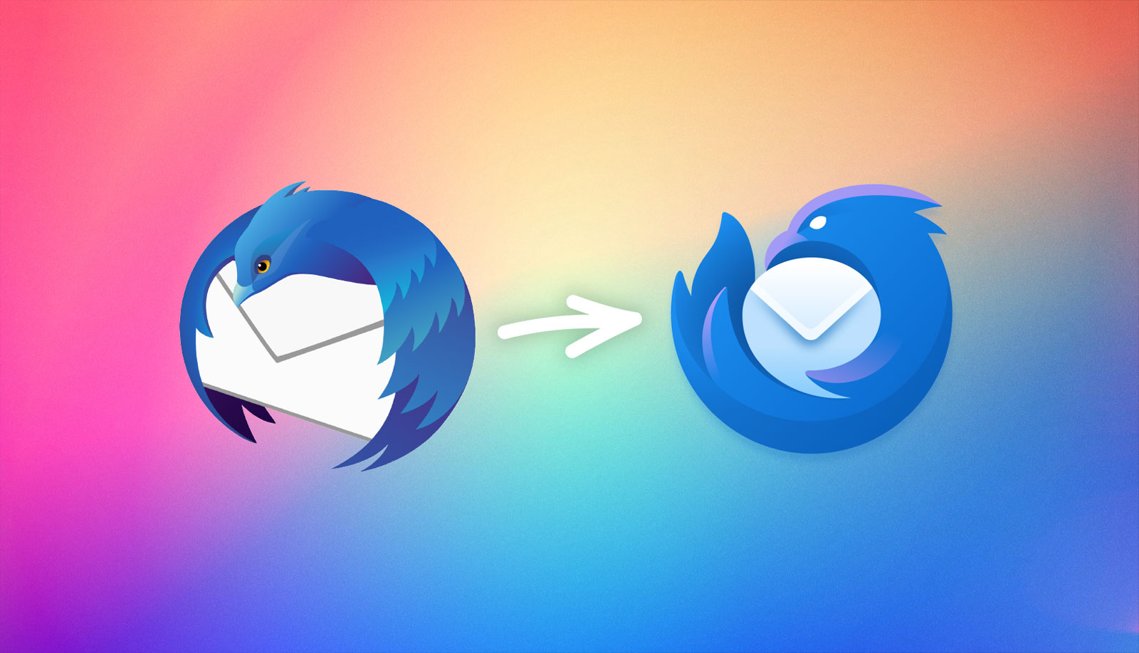
Don’t use it any more myself, but my inner graphic designer gets really excited about new logos
You must log in or register to comment.
I think it is neat. More consistent with Firefox and I am glad it still has an envelope in the center.
It definitely is neat, but I did like how before it looked like the thunderbird was delivering a letter in it’s beak, and now it’s just cuddling with my mail instead, which I feel is a bit of an awkward hobby
I especially like that if you put Firefox and Thunderbird logos next to each other, the mascots are looking at each other. Or deliberately ignoring each other. Depends on the order…
🙂
The old logo was better ngl
Damnnnnnnnn! Getting me hyped for the redesign.


