

You must log in or # to comment.
Are you sure it’s not a scientific calculator?
Where are fitness centers 1-5?
There’s an elliptical in the ballroom and a pilates reformer in the lobby.
I believe they’re on 2
They died.
I’ll be on floor 13
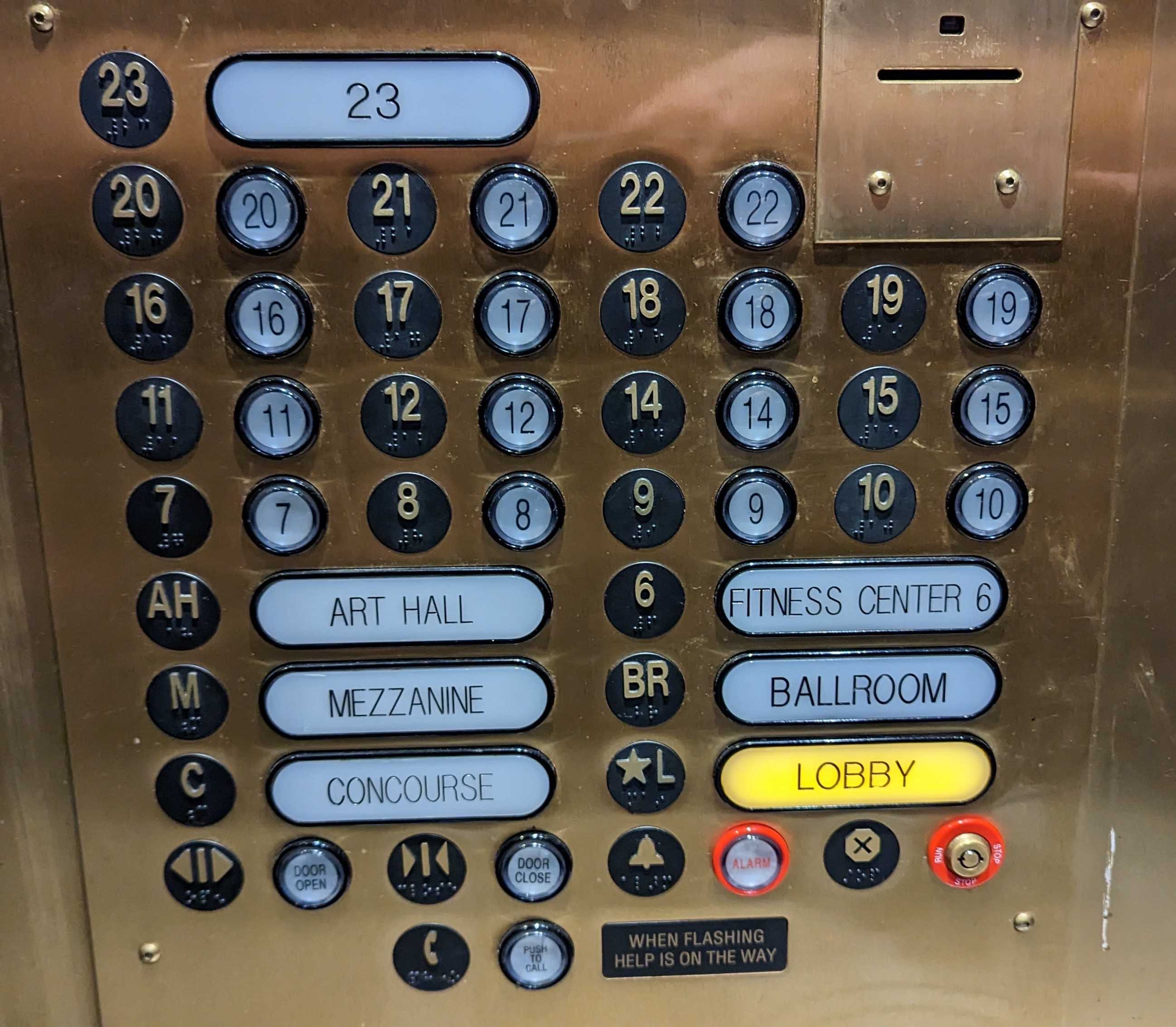
AKA the ball room
Cue AC/DC!
I think the floor 23 button is the most irritating
“That’s not so bad. Wait… where’s… one?”
My feeling is that is what they wanted to solve. There might be multiple ground floors due to this being a big building and most likely have entrances at different levels. Maybe both the Lobby and Concourse have entrances. I’m just guessing. But even if this is true, it doesn’t make it any less hideous in their execution…
For once, I don’t see the problem here. It’s typical in American elevators to mark the ground floor as “*L” instead of “1”. This elevator actually goes beyond the customary by spelling out “Lobby” for “L”, “Ballroom” for “BR”, etc. I’m guessing this is a hotel, and most hotels have floor buttons like “L” and “M” with no further clarification because you are expected to know that “M” means “Mezzanine” and what a mezzanine is. This is cultural knowledge. Are you going to be mad when you go to Germany and floor button “1” takes you to the 2nd floor?
All the floor buttons are in order. No floor button is mislabeled. Higher floors are always above lower floors. Floor 13 is missing but that’s cultural too. Floor 23 is bigger to show its importance, because there is probably a rooftop restaurant or some shit. Looks good to me!
Ha! I worked in one of those German-like buildings. In Quebec. Every other building in town goes L, 2, 3…
Ours did L, 1, 2… (well, we do RC for L, but you get the idea)
Turned into like 50% of my job to clear up the confusion.
Art Hall must have done pretty well to have his own floor.
deleted by creator
23
~~ edit: apparently I don’t know how to use Lemmy’s header markup ~~
23 sticks out over the edges of 22, builders couldn’t measure
Gotta put a space after the #
thanks!
edit: ugh, but strikethrough is no space. what the heck.
Very good layout. Would never obstruct law enforcement or medical professionals during an emergency.
Everything is clearly laid out too.
Goddamn it, that’s hideous. Imagine being late for an important appointment, you finally get to the building, run through the lobby to the elevator and then…
It’s the first test for you job-application :-)
I… What? Why would you do this? What madness lives in your heart to design such a thing?
My friend used to live in this building. It took me way too like ng to find her floor!
what am I even looking at
Please tell me there are 3 other shafts and the building has 70 floors. This is insane.
At least blind ppl can use all of the black buttons, so that is something. Sucks for them to find to the lobby tho
Star L is the lobby button, I don’t think the long labels are buttons at all. So if they equate feeling an L like shape as the lobby a blind person can still use this. Although obviously Braille is always best.
Oooh, I missed that completely. The design is so weird I was sure the white buttons where actually buttons. Then that is all good! :D it looks like the black buttons got braille on them but I am unsure
Oh yeah they do, I wrote my last comment thinking of the image from memory and didn’t notice the braille. I’m certain the white ones are actually lights to show where the elevator is currently at because the buttons themselves don’t light up
Where’s the instant party button?
Good job little star, I know you’re trying your best little buddy.


