
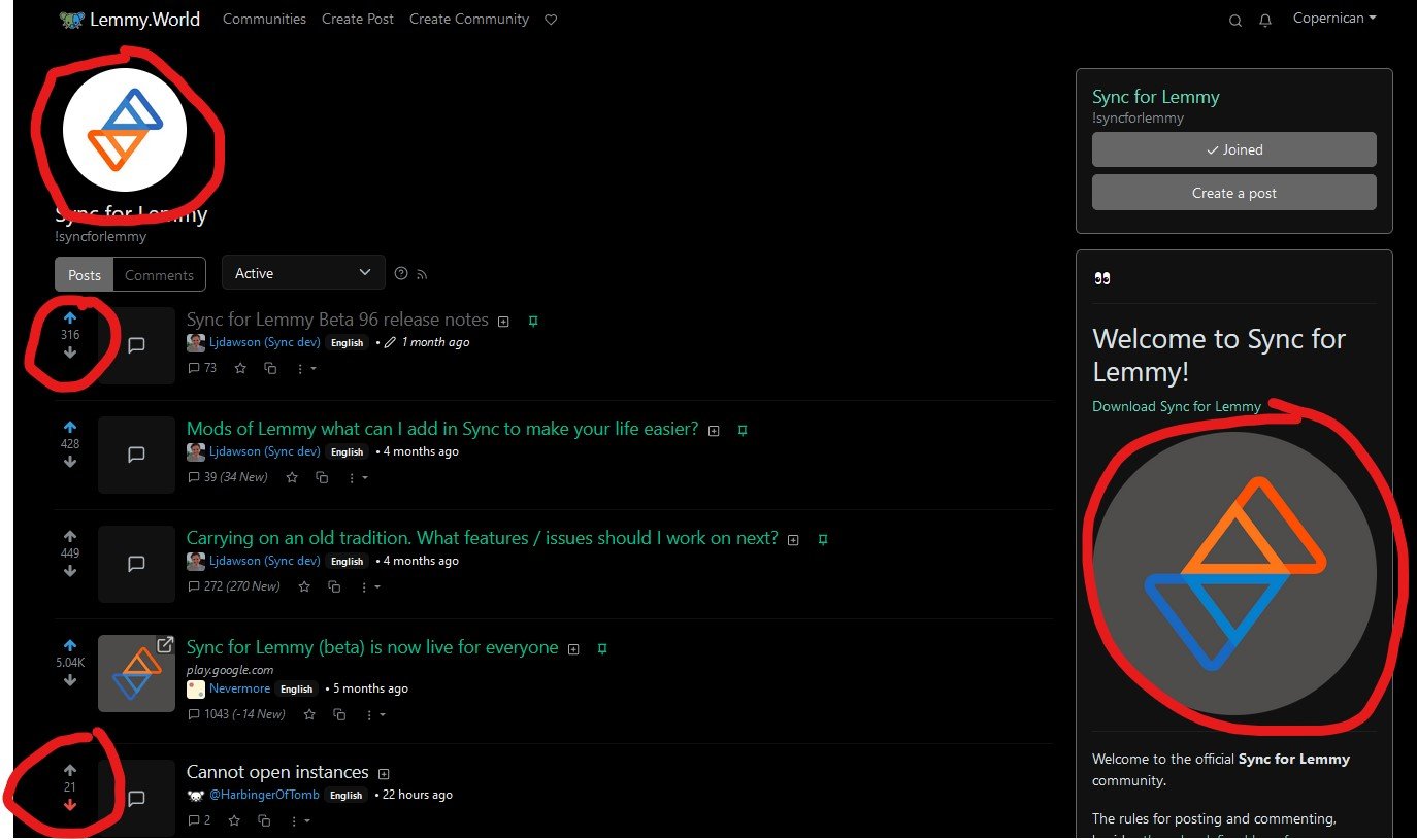
I’ve sometimes gotten confused switching between the web interface and sync app because the Sync app follows Reddit style with orange for upvote and blue for down, whereas Lemmy is blue for up and orange for down. But now I’m confused since there are 2 sync logos with different up/down colors. Will future release change the Sync colors to align with Lemmy style for up/down votes?
(also, undoing that down vote, just wanted to snap pic of the web ui!)
Honestly, Lemmy is the wrong one here. Red/orange for up and blue for down follows the nomenclature for raising and lowering temperature. I’m guessing they changed it to just be different from Reddit.
Yeah it’s not exactly subtle that they went exactly opposite from Reddit