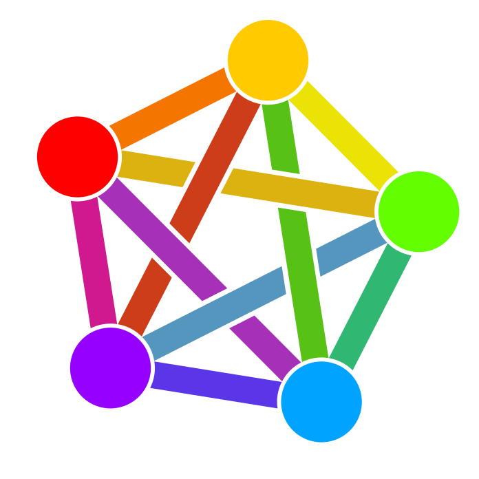
That visualization shows exactly why the whole thing here is overwhelming for the average user. I feel that the federated aspect should be less focused on when talking about the fediverse. It makes sense to explain it, but many explanations on how to switch to lemmy/kbin/whatever put the whole federation thing on top of the list. I think this is a big turnoff for casual users/lurkers. They do not understand that they don’t need to understand the structure of the fediverse to join, enjoy content and engage with others, so they don’t even start.
I’m sure a visualization could help with that, but having a bunch of boxes and circles with arrows all over the place isn’t exactly something that will mitigate the feeling of being overloaded with information. I’m not saying you didn’t do a great job. “Arrows all over the place” is not meant to devaluate your work, on the contrary, it perfectly captures the feeling i have about the fediverse, but I would not use that image as an ad for it.
true. I am literate in internet/computer yet the idea in general is still confusing. Navigating is also abit jarring, and I dont understand some buttons and features like “boost”. It would be great for beginners to include a tutorial for navigating the UI and a short introduction of the fediverse in #teachmelikeim5 level