You must log in or # to comment.
Ctrl C + Ctrl V
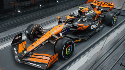
I admire people who can look at this and spot any difference without putting 2023 and 2024 cars side by side. Anyway, I like it, so it’s good that it’s more or less the same!
Just the colour on the chrome logos looks lame. I can forgive it on the wheels I guess because it looks cool when it’s running, it the chrome logo on the engine cover just looks wrong to me.
Please be fast…pleaseeeee
Has to be better than last years terrible start.
They finished very strong though
I really don’t like the trend of unpainted panels everywhere to move tiny amounts of weight into the floor. FIA should enforce that a certain percentage of the body be painted.


