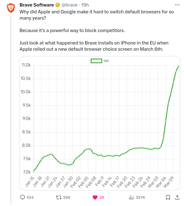
This graph gives the impression that the total installation number has been multipliés x4 or X5 while it is not the case when looking at the raw numbers.
Any variation can look impressive if you zoom enough, that’s why you need a baseline at 0. This way you see thé entire scale of the phenomenon
Yes but the graph goes from 2 rectangles above the bottom line to 8 rectangles above the bottom line in that final surge.
So visually, it looks like it has quadrupled.
While I agree for the sake of clarity, a bigger problem is that it only goes back less than 2 months. Has the number of installs been steady at 7k for a long time? Or does it fluctuate wildly like this occasionally for reasons totally unrelated to laws?
I was just clarifying the original comment about the baseline not being 0.
Tbh, I hadn’t even looked at it properly and only noticed now that the timeline isn’t one month per box.


This graph gives the impression that the total installation number has been multipliés x4 or X5 while it is not the case when looking at the raw numbers.
Any variation can look impressive if you zoom enough, that’s why you need a baseline at 0. This way you see thé entire scale of the phenomenon
How so? It goes from ~7 to ~11. That’s not even x2.
Yes but the graph goes from 2 rectangles above the bottom line to 8 rectangles above the bottom line in that final surge.
So visually, it looks like it has quadrupled.
While I agree for the sake of clarity, a bigger problem is that it only goes back less than 2 months. Has the number of installs been steady at 7k for a long time? Or does it fluctuate wildly like this occasionally for reasons totally unrelated to laws?
I was just clarifying the original comment about the baseline not being 0.
Tbh, I hadn’t even looked at it properly and only noticed now that the timeline isn’t one month per box.