Or it’s removing white space so you can actually see the difference in the data. Like stocks, if stocks started at zero, you wouldn’t be able to see day to day or even a week to week difference…. Not everything can be covered by general rules.
You can only properly understand the data by reading it, if you glance at it and make assumptions and conclusions, that only speaks volumes about yourself.
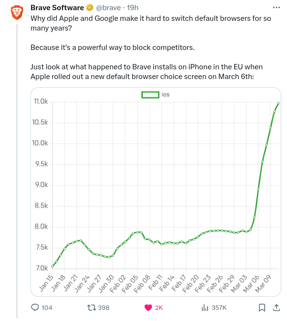
If counting from 1 to eleven is too hard for you, I don’t think observing that the scale is from 7 to 11 is within your grasp. So, why do this. Absolutely, there are reasons to not start a scale from zero, stocks are a great example, but I don’t think those reasons apply to this graph or the information they’re trying to convey.


Or it’s removing white space so you can actually see the difference in the data. Like stocks, if stocks started at zero, you wouldn’t be able to see day to day or even a week to week difference…. Not everything can be covered by general rules.
You can only properly understand the data by reading it, if you glance at it and make assumptions and conclusions, that only speaks volumes about yourself.
If counting from 1 to eleven is too hard for you, I don’t think observing that the scale is from 7 to 11 is within your grasp. So, why do this. Absolutely, there are reasons to not start a scale from zero, stocks are a great example, but I don’t think those reasons apply to this graph or the information they’re trying to convey.
Yeah… it just doesn’t work with the given information, there is actually a reason why they specifically posted the other one….