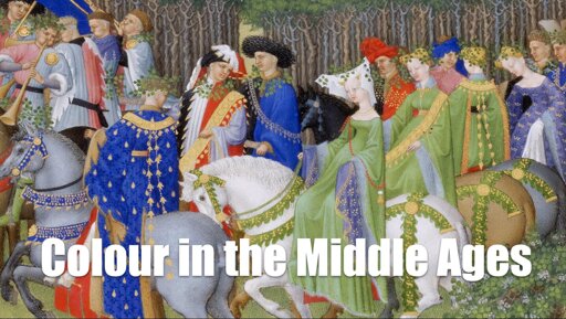
Green […] was also regarded as a soothing colour. Scribes often kept emeralds and other green objects nearby to rest their eyes. The poet Baudri de Bourgueil even suggested writing on green tablets instead of white or black ones for this reason.
I don’t know how much of a myth or fact it is, but people still talk about green being easier on the eyes than red, yellow, or blue.
Michel Pastoureau writes that “the true medieval opposite for white was not so much black as red.” […] the black and red sets common in India and the Middle East.
It’s interesting to note that colour vocab in languages typically start with this trinary distinction between white, red, and black; or rather light, warm, and dark.
Michel Pastoureau’s book on blue begins by highlighting the neglect this colour faced among the ancient Greeks and Romans, who rarely wrote about it or used it.
It’s all about material conditions. Not a lot of the natural world around us is blue, so there isn’t much to talk about it on first place unless you have synthetic pigments.
He even explores the intriguing question of whether ancient peoples could perceive blue at all!
They even had specific words for the colour dammit. Cue to Greek κυανος/kyanos and Latin caeruleus.
I wouldn’t be surprised if this silly “question” backtracks to Homer’s descriptions of some things, like that wine-faced seaway. (inb4: Homer was calling the sea a drunkard, not wine-coloured.)
This neglect persisted through the early Middle Ages until the twelfth century. “Then suddenly,” writes Pastoureau, “in just a few decades, everything changes – blue is ‘discovered’ and attains a prominent place in painting, heraldry, and clothing.”
Material conditions, again: the rise of Venice allowed an influx of lapis lazuli into the European markets. Note that the main blue pigment of those times (ultramarine) was basically crushed lapis.


