
Some real beautiful data graphs in this paper
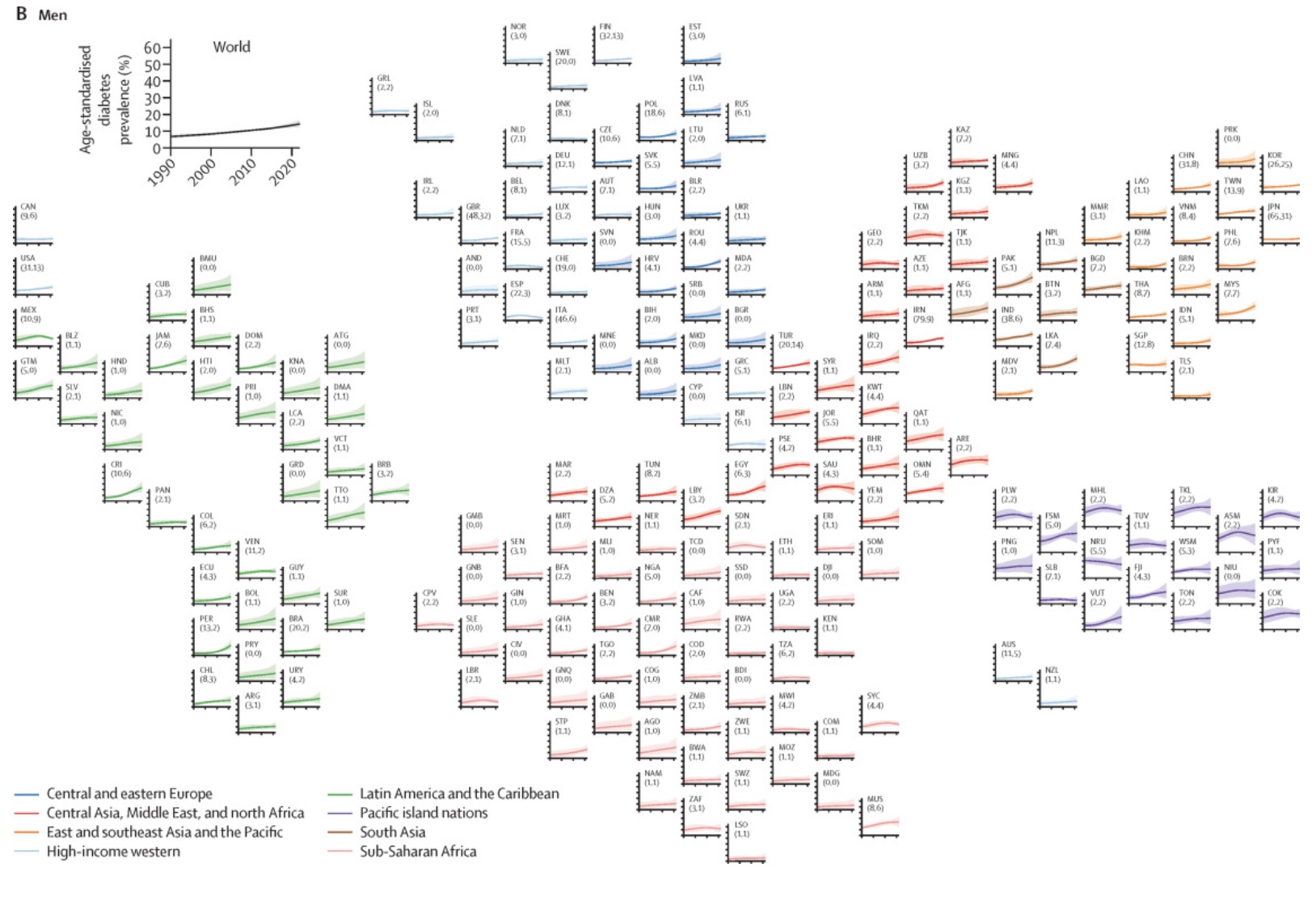
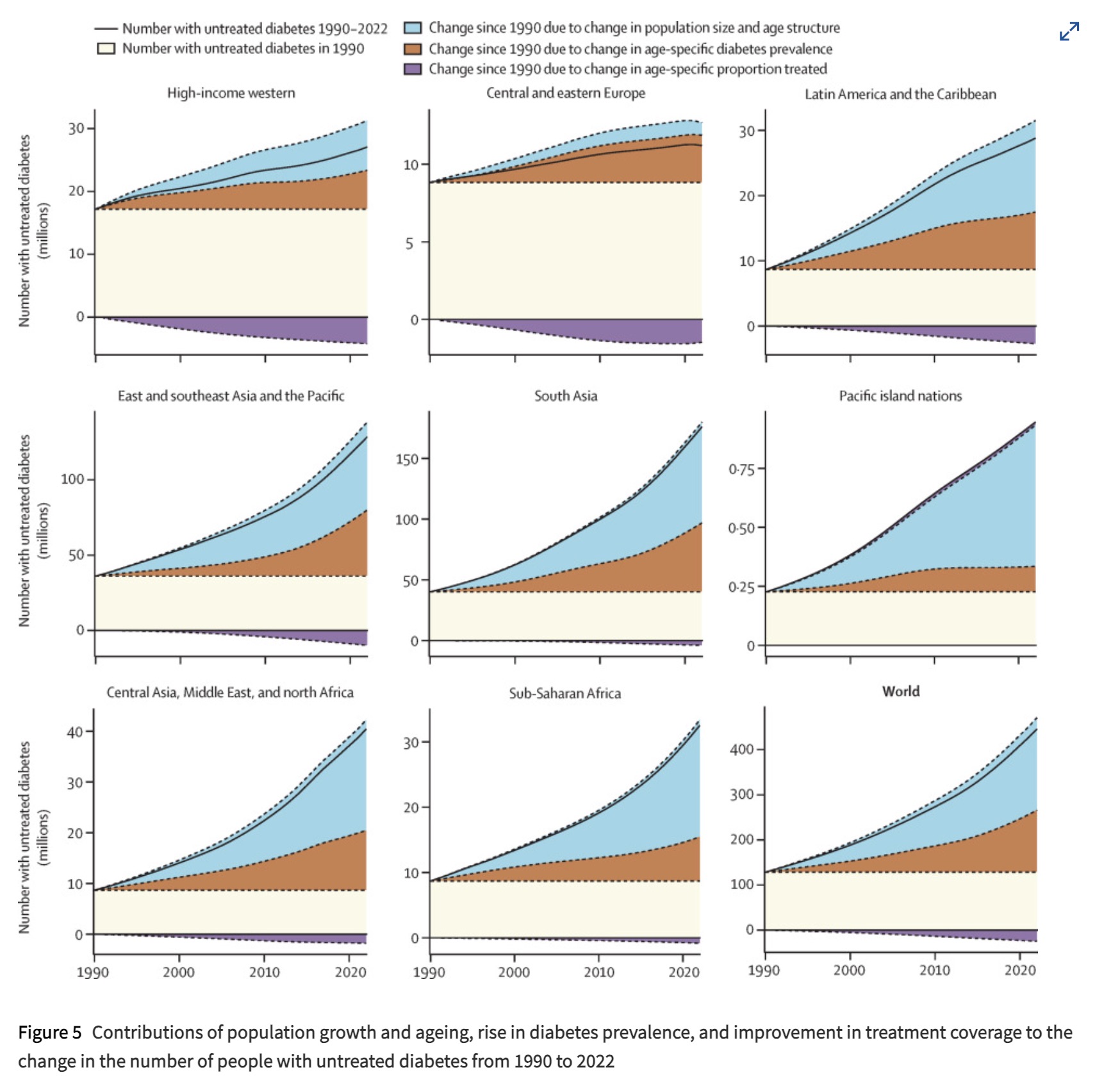
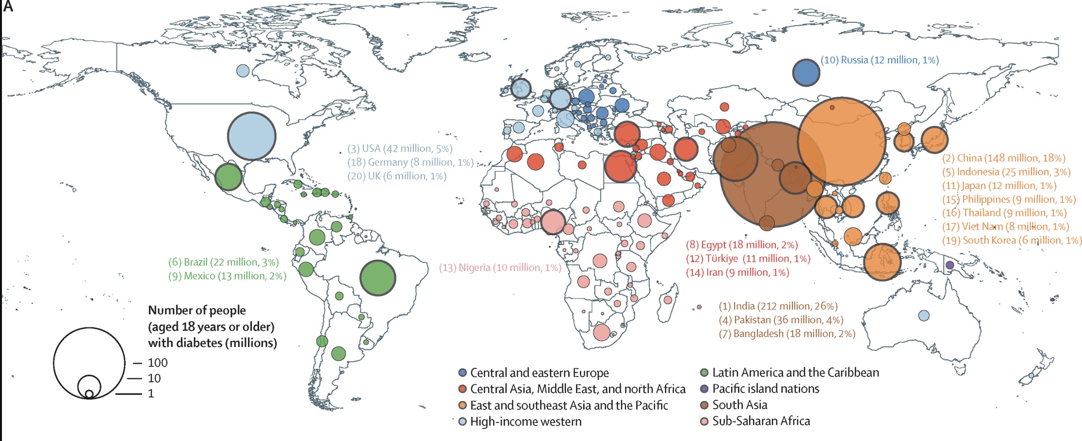
Source: https://doi.org/10.1016/S0140-6736(24)02317-1
The Top 4 Countries by rate:
- India 26%
- China 18%
- USA 5%
- Pakistan 4%
This is only accounting for tracked diabetes, so some of the areas might have larger numbers.
You must log in or register to comment.
I forget where I heard that the only people the CCP bow to are Coca-Cola. It’s shocking how much of the world they basically own.
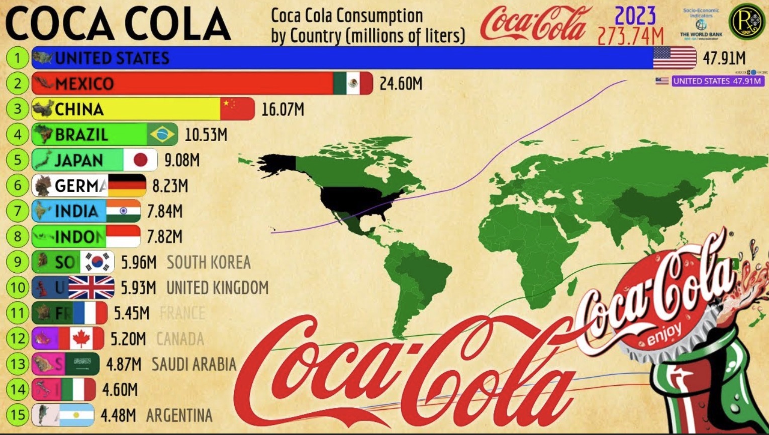
https://worldpopulationreview.com/country-rankings/coca-cola-consumption-by-country
Soda should just be called diabetes water at this point.
A bit hard to draw anything from that graphic other than raw consumption. Realy needs to be per capita
https://worldpopulationreview.com/country-rankings/soda-consumption-by-country
They claim to have percapita data
It’s a shame these graphs - all the graphs in the paper - report number of people and not rate. Makes it yet another population map, although the exponential growth of untreated diabetes in Americas and Asia is a pretty stark contrast to Europe, even without normalization.
The graph is sorted by percentage
https://hackertalks.com/pictrs/image/68f9d752-29df-4be5-b085-0ddb3b55cc01.jpeg
So what the hell is going on in India and China? 26 % and 18% are huge numbers compared to the usual 1% in the rest of the world.
Yeah, that is a puzzle.
India does have a very large vegetarian population, which means they have a high carb diet, which is a necessary component of T2D.
That doesn’t explain China, china is the puzzle. I’ve seen a theory that the only major dietary change in China is the proliferation of industrial cooking oils which does increase insulin resistance in mice.
Yeah, it’s around a fifth of the population. There must be something seriously wrong there. Like something not found anywhere else but widespread in those countries.
Europeans tend to have hyperplasic fat, and Asian tend to have hypertrophic fat. Meaning a European can get much fatter then a asian before the REALLY BAD THINGS start to happen. That might be a variable

