I really don’t like the design of the progress pride flag, and I couldn’t really put my finger on it until I saw this: https://nava.org/good-flag-bad-flag
For reference, here is the flag I’m referencing as “bad flag”:

And here is the original:

So, the original has too many colors, but it’s the colors of the rainbow. In order. It’s recognizable from really far away, and it’s dead simple to draw.
With the Intersex flag, that’s 14 colors. There are three shades of “purple”. The circle won’t be visible from far away. The chevrons are too thin to be very recognizable from far away.
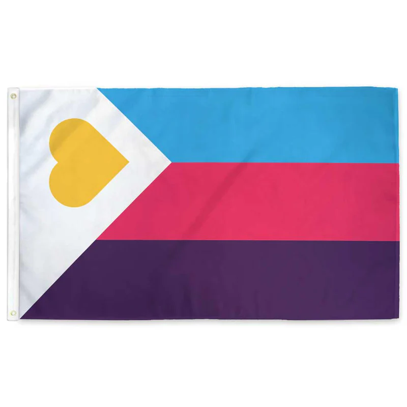
It’s not like there aren’t good pride flags. Like there are AMAZING ones:


Edit:
In case you don’t know what these are: https://flagsforgood.com/collections/pride-flags


Also, people who like the color “Medium Aquamarine” are not represented either
Truly outrageous that we won’t (obviously out of pure hatred) represent everybody with a different color/symbol. After all we’re only ~8 billion people on planet Earth.
A flag with ~8 billion individual lines, all of a unique color.
Might be hard to render on a computer. Most displays can only display around 16 million colors. 😔