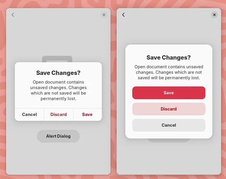
New GNOME dialog on the right:

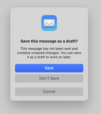
Apple’s dialog:

They say GNOME isn’t a copy of macOS but with time it has been getting really close. I don’t think this is a bad thing however they should just admit it and then put some real effort into cloning macOS instead of the crap they’re making right now.
Here’s the thing: Apple’s design you’ll find that they carefully included an extra margin between the “Don’t Save” and “Cancel” buttons. This avoid accidental clicks on the wrong button so that people don’t lose their work when they just want to click “Cancel”.
So much for the GNOME, vision and their expert usability team :P


I think that a lot of the recent GNOME design choices are merely because they’re trying to improve usability on mobile devices. It also just so happens that Apple is trying to make the macOS desktop closer to iOS to encourage people to move from Windows. They have similar goals, which leads to similar design choices. And all design is derivative, anyway. Who cares.
You aren’t wrong, but that has nothing to do with he issue at hand. They should copy each other if a solution is good, and that’s the issue here, GNOME forgot to copy a good UX practice that Apple actually took the time to implement.
So just use apple if you prefer apples menu layout.
This ain’t as big of an issue as you seem to think it is.