
I’m a fan of the yellow paint or otherwise highlighting of things I can do things to/with over having everything look the same and being required to click everywhere, all the time in order to know what I can, and cannot, interact with.
Playing the original Hitman vs the newest Hitman is such a drastic change not just because of the graphics, but because of little design elements like that. Makes it way easier to plan what you’re gonna do when you know for sure what you can work with.
It also means you’re less likely to miss something in a place you’ve been in and having to come back.
Anyone against highlighting interactables and enemies wasn’t around for games in the 80s-90s. Fucking, why were interactable items and fixtures so common and so goddamn bland?
Sorry, you didn’t flip the hourglass in Morg’s Inn before the end of Chapter 5 so you’re stuck with the 3 terrible ending sequence options. We only put a vague hint about it on page 63 in the instruction booklet.
Which Sierra game is this?
All of them.
Holy shit, you just unlocked a bad memory! Thanks…
nothing like playing leisure suit Larry 2 and finding out you have to replay the last 4 hours even though you saved because you didn’t type look in trash can while standing next to the trash can on the first screen of the game
Most early 3d and sort of ps2 era games didn’t have leisure to put too much extra elements into environment, most of what you saw was interactable, so highlighting wasn’t all that needed. Sure there were games badly designed and unintuitive, but it’s still weird to me how highlighting became a norm / necessity.
That’s just not true. I imagine a lot of the kickback is coming from those of us who grew up playing those games, because when done right, there was a deeper sense of exploration and a more active role in decision making.
What’s wrong with the sparkly effect from e.g. Resident Evil 4? The yellow paint is already immersion breaking.
I’m a fan of outlines, myself. There’s no such thing as a correct answer here. Yellow paint, sparklies, circling white lines, glowing, pulsing, rainbow stickers, whatever. As long as it isn’t as odd as god of war where runes emphasize all wilderness climbing walls, my suspension of disbelief is unfazed. Took me a while to figure out that you can climb them. I just thought they were decorative for like 5 confusing minutes.
I just think the yellow paint is so overdone, it kinda pulls me more out of the experience than other “unrealistic” shimmers. It’s a bit like the uncanny valley effect.
I can remember a time or two when I was lost because I didn’t know what to click on, but it usually seemed easy because interactable stuff usually stood out in some way.
yeah you either yellow paint things i can climb or fucking let me climb everything that looks climbable a la Assassin’s Creed.
If they stopped making everything the same bland color palette, I wouldn’t want the yellow paint. There are other options, but this is the compromise I guess we came to
I remember in The Legend of Zelda: The Wind Waker, a tip was to look at link’s eyes if you don’t know what you’re supposed to do, as he was designed to look at things that are important
Yo that’s awesome!
i think it might be a problem with the design of the rest of the game, maybe too many distracting elements necessitate the yellow paint. in real life i can function without yellow paint. i used to be fine without it in games, especially hitman contracts for example. it could be due to graphical fidelity, which seems one of the reasons battlebit made such a surprise success in the military shooters. in modern games with too many 3d rendered objects you can’t see clearly what’s going on - in real-life you at least have depth information to distinguish things, it’s not all in the same plane in front of you.
however, i found the old hitmans so much more immersive. i really disliked feeling guided around as if it was a theme park in the latest ones
In real life, you can also interact with everything you see. In a game where everything can be interacted with, I can agree that it would be distracting. But in like 90% of them, there is only a very specific amount of interactable objects, so it’s nice to know which are which.
Also in real life yellow paint means you’re not permitted to interact with it and to please be aware of its presence. It’s the “hey listen! Don’t hit this with a forklift dipshit” signal
however, i found the old hitmans so much more immersive. i really disliked feeling guided around as if it was a theme park in the latest ones
Have you disabled all help, hints and the minimap in the options? I disabled absolutely everything in the new games and liked it very much. Then the game does not give you any kind of hints or HUD help, only what you can see with your own eyes in the game.
in real life things don’t have to be programmed for you to be able to interact with them. in games they do. and most things will be non-interactive set dressing.
the reason old games didn’t need this is because they only had environment + interactive objects and characters. no decoration. “realistic” games today couldn’t get away with empty buildings and rooms with no objects except health packs and ammo.
I prefer it when things have no indicator other than being kinda prominent, but I can press a button to enter a mode that points things out.
I’m so glad Ass Creed is top comment to this, because those games get a lot of shit, but the traversal is absolutely too notch. “See that mountain? You can climb it” should totally be their line, these days. It’s become slightly boring though. Because no challenge.
The first person version is still fun though. Frontiers of Pandora has fantastic traversal, with crazy jumping and catching ledges and shit, but still not actual climbing. And not a drop of yellow paint anywhere.
The only way to get rid of the yellow paint is to either make better readable levels that are less realistic like Zelda dungeons. Or make everything climbable like in Assassins Creed. But then you get an entirely different game. Unfortunately people are dumb. Developers find out during play testing that a significant percentage of players will get stuck somewhere and then they add yellow paint.
Yeah, there are a bunch of tricks to make levels readable, but yellow paint is by far the easiest.
One that you may have noticed in the past, but has become increasingly less common as “realism” has taken over graphics instead of art, is interactable doors having door handles but static ones not having them. It’s a very quick way to tell the player there’s nothing to do without ruining the look.
A option that is especially easy to see in FromSoft’s games is leading the player with things like torches. They fit in the world, but can also work as guidance.
I really appreciate when developers actually consider the problem they’re trying to solve and find something that works for them. Sadly with all the “design by committee” AAA games, they just pick the easiest, most boring, but well tested option, which is how you have every game with yellow paint. It does have a purpose and it almost always works, but there are so many more options to accomplish the same task that may work better.
yeah that’s true. Better readability without destroying the realism is possible. How ever I think studios like FromSoft can get away with subtle direction pointers since their target market is seasoned gamers. While a Playstation Studio dev studio who basically makes interactive stories nowadays and markets to the masses, from new gamers to veterans, has to unfortunately use the most on the nose method to please the least experienced gamers.
This cave is not a natural formation…
This line was recorded when the entrance was more natural looking, but play testers had trouble finding it. The entrance was changed to be more obvious, but they didn’t have time to rerecord the lines and it still made enough sense, so it was left.
Also, having played Bungie’s previous FPS, Marathon… yeah, there’s some maze-hell levels in that game. Everyone memes on Colony Ship For Sale, Cheap, but Fire! Fire! Fire! Fire! Fire! was a real hell to figure out without guides. I understand wanting players to actually finish their games.
Part of the problem may very well have been the lack of contrast in a natural design. A lot of players would have been playing on old CRT displays.
I’m one of these dummies. I can’t help it. I’m constantly lost in video games. Hell, I’m halfway lost most of the time outside of video games.
If people stop being stupid the yellow paint stops
Same reason why explosive Barrels are always red
Some devs tried to change the color and nobody gave the barrels a second thought
Wrong. If the devs can’t communicate something without copious amounts of yellow paint, that’s a failure of design, not player intelligence.
its both
They should make the barrels that explode when shot red in real life too, just in case.
Victim blaming
There are actually very good executions of “yellow paint” guiding
Stray is a good example
Deus ex intensifies
Human Revolution? It’s nothing but yellow.
Love Stray, but it might not be the best example. It’s not exactly subtle…
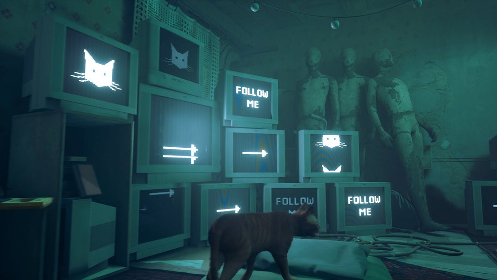
Though, you do learn that lots of the hints are actually a robot character named Momo deliberately leading you to Dead City. It’s a great game, but it would be way harder if the environment didn’t light up your path.
Yeah not exactly subtle but you’d be suprised how much I had to point them out for my 13 yo brother to see them. New players just don’t understand how story mode works I guess. He loved the game though
The explanation they gave at the end of God of War was pretty awesome.
What was it? I didn’t play the game.
It was due to devs hating the player with every ounce of their being. They originally had sharp flashes of red and blue lights every time Kratos solved a puzzle but Sony made them remove it.
Huh? How is this an explanation for the yellow paint on ledges?.
The reason is a spoiler
But they did test without yellow paint, the testers kept getting stuck and complaining.
Feel free to share in a spoiler bracket. I won’t play the game anytime soon.
he is called the peer
he hunts my dreems with his P
O.P.T.I.O.N.A.L.
I genuinely don’t know why this is a debate. There are intentionally difficult games that have accessibility features. There are games that don’t cater to everyone out of the box, but a simple toggle on the pause screen enables colorblind mode, etc.
If they’re already putting yellow paint in a game or considering it, just spend an hour of development time giving players the choice to disable it and literally everyone wins!
just spend an hour of development time giving players the choice to disable it and literally everyone wins!
As a senior games programmer, depending on the engine and a ton of other very game-specific stuff, I’d guesstimate that anywhere between a 5 minutes, 1-man job and a several days long task potentially spanning multiple poles (mostly thinking of LD, 3D artists and tech artists. And obviously programming and UI)
Even fixing a single typo is not a 5 minute 1 man job if you take the full task (issue tracker to commit, potentially time tracking,…) into account.
Did I low-ball it? Possibly. But even by your estimates, that’s absolutely nothing in the years-long endeavor of creating a game. Especially considering the development resources that went into putting yellow paint into the game or engine in the first place! And just like other accessibility features that can be toggled on/off, the more they are implemented, the more efficient the mechanisms for enabling and disabling them in games… Like I said, everyone wins.
Not really. Yellow paint isn’t a thing for shits and giggles, it’s there to make the game readable.
Before yellow paint, games needed to have good art direction (instead of “realism”) or good environment design to either make it clear something is meant to be interacted with or to point the player in the right direction.
Simply removing yellow paint doesn’t suddenly improve art direction or environment design, it just makes the game needlessly hard to read.
Who… are you arguing with? Did you read any of my comment at all? The yellow paint is already here to stay! I’m saying give the players the choice to enable it or not. That’s all! They’re putting it in the game anyway…
Who… are you arguing with?
You?
Did you read any of my comment at all?
Yeah?
I’m saying give the players the choice to enable it or not.
And I’m saying that by giving a choice at all, you’re already failing the players that don’t want it. Aka, not a “everyone wins”.
My point is that yellow paint isn’t bad because it’s ugly or breaks immersion, it is bad because there can be good design that communicates the same thing without being ugly and immersion breaking.
Removing the former doesn’t suddenly bring the latter into existence.
The yellow paint is already here to stay!
I’m arguing that it shouldn’t.
I’m saying that by giving a choice at all, you’re already failing the players that don’t want it.
“It’s not enough that I can choose not to have yellow paint, I should be able to choose for everyone else too.”
Any time you’re anti-choice, you’re probably in the wrong…
Imagine you have to go to the grocery store (interact with an item), but it’s far, so you can’t (the game has bad readability).
Someone makes cars (yellow paint).
Post OP says: fuck cars (yellow paint).
Comment OP says: I think we should be able to choose between having cars or walking (having yellow paint or not).
I’m saying: this option sucks (having yellow paint or nothing), we should have good public transport instead (good art/environment design that doesn’t cause confusion).
Is that a hot take?
It’s really tame what on earth is with the downvotes
Hey buddy, FUCK YOU!!! I’m gonna downvote your tits off!
(And they say the internet raises anonymous hostility in online discussions)
Okay, I don’t like cars either, and I don’t own one. I also acknowledge that most people have cars and want to use them. I can still walk to the grocery store, I do it literally every time I go. People are still driving cars, and I’m still walking.


