

This isn’t beautiful, it’s borderline unreadable. A stack like this is a very poor choice to show changes in relative proportion over time. A simple XY plot with dots would be better.
Sounds like you just don’t like 100% stacked column charts. This is their primary use case after all. I can’t see how an XY plot would do a better job, wouldn’t there just end up being a ton of overlap, making it hard to discern the differences between the smaller segments? Do you have an example where you think an XY plot represented this type of data better?
It makes it difficult to make within group comparisons due to the shifting baselines. They are fine for “gee whiz” global impression but simply not appropriate for detailed analysis. And yes, I greatly despise them.
chill out
The millennium was clearly when social harmony peaked
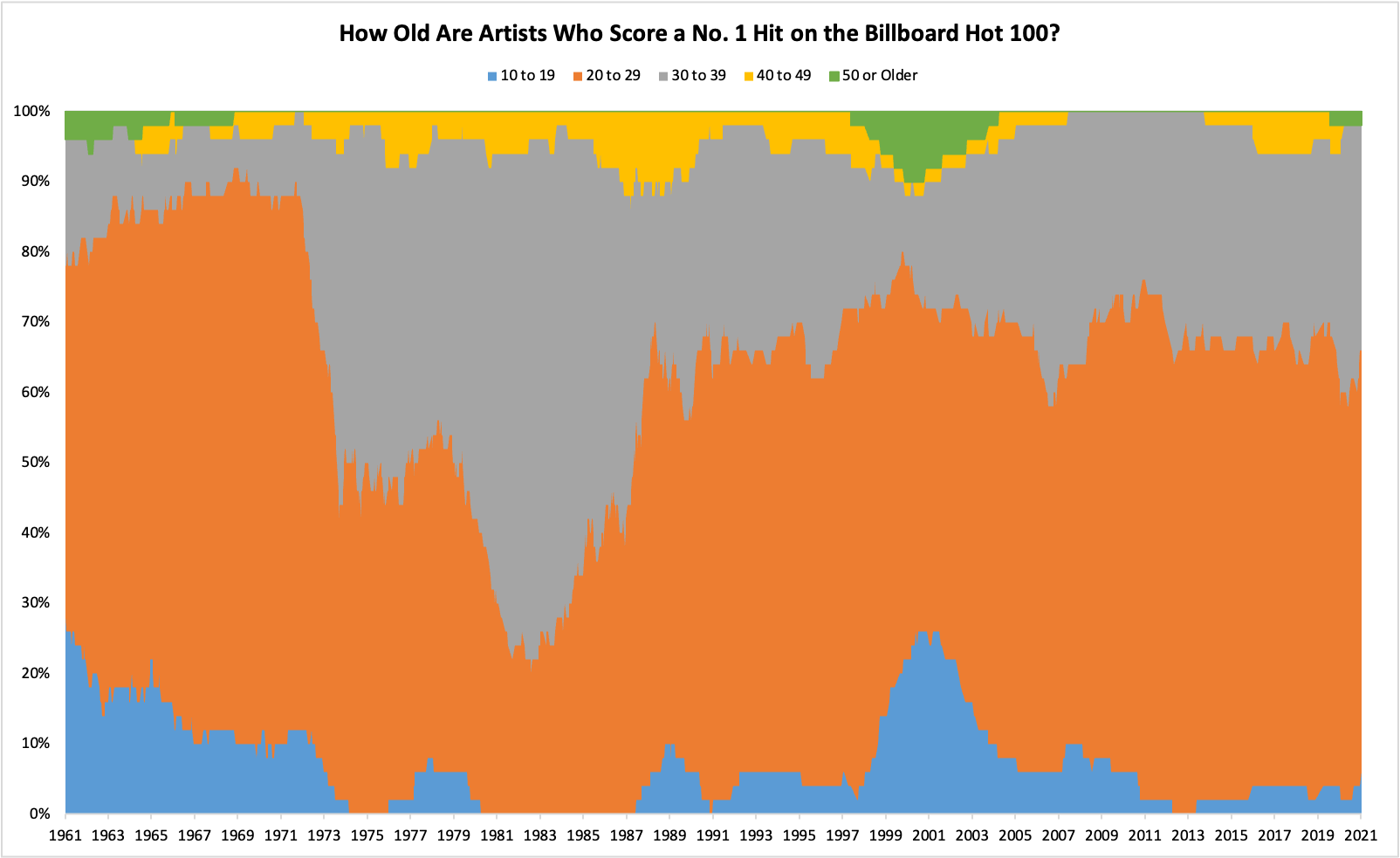
What happened in the 70s and 80s for artists in their 20s to lose their dominance so much?
They turned 30 and kept selling records :-)
Ah the early MTV era, such a good time to be alive for music.
Someone who was 27 in 1969 was 30 in 1972 and moved into the next age bracket
I think it was the baby boomers switching age ranges
Tldr: 20-40
Wonder who the naughts 50+ artists are.
Johnny Cash for one.
Johnny Cash for one. Bowie is another.
It was probably some artists from to late 60s doing some kinda comeback
Its interesting how 50 and over just doesn’t exist during the prime boomer years. They really hated the older generations
So your telling me gets a chance?
Hey, is 2001 the Mm-Bop bump?
I think it’s the top of the teen boy/girl group hype?
But then strangely a high proportion of over 50s at the same time!
Hanson was quite a bit earlier.


