

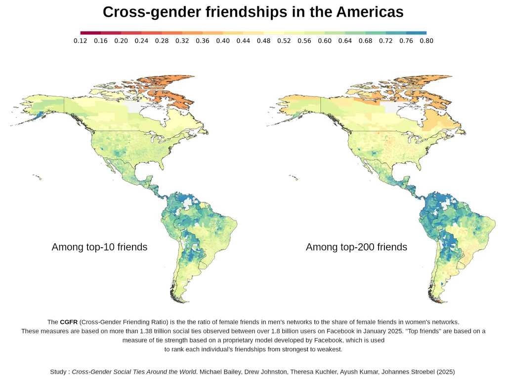
200 seems a bit much. I feel like I would run out of friends well before then.
Edit: read the paper and it makes sense since it’s Facebook friends and not survey results.
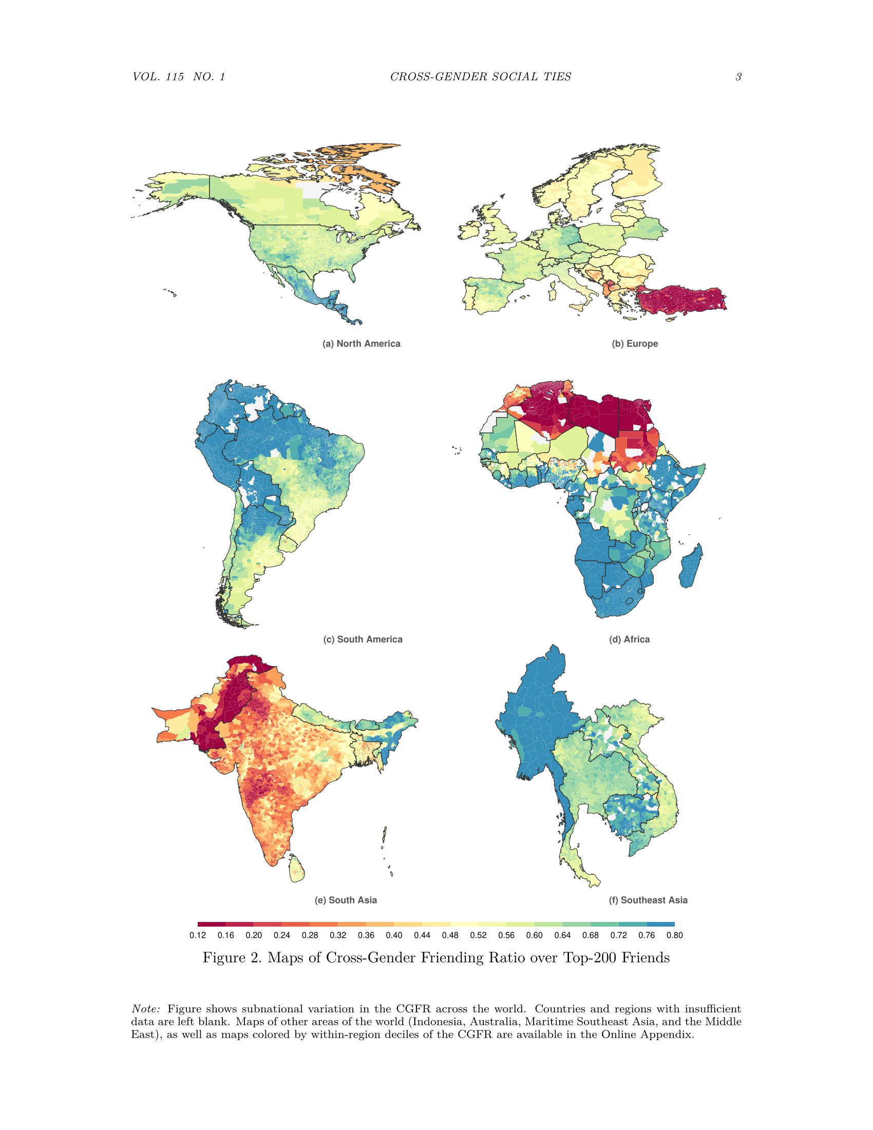
You can strongly see the cultural influence of Islam in Turkiye, North African and Pakistan.
Also in the US blue looks correlated with larger latinx populations, matching the much bluer populations in central and South america.
It also looks like more extreme climate weakly selects for more gender segregation - look at the more barren southern parts of South America, far north Canada, Scandinavia - but the effect of culture is clearly stronger.
You can see the Muslim populations in other parts of Europe: Albanians in Albania, Kosovo and Western half of North Macedonia. In Bosnia the Bosnian parts are more red as well, Northern and Eastern Serbian parts are lighter:
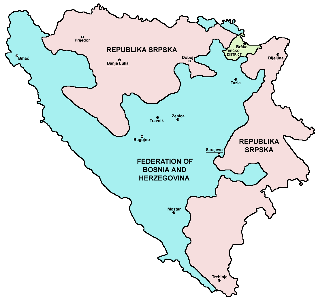
Serbs are Orthodox Christians, Bosniaks are Muslim and the minority Croatians are Roman Catholics historically.
If you think the weather in the Amazon isn’t extreme, I’ve got brews for you.
Edit: news, not brews, but leaving out there in case you’re keen on ayahuasca.
German internal border still visible.
What is the reason for the big divide in Brazil and Argentina? The blue parts have more indigenous descents, while yellow is predominantly European?
What is the reason for the big divide in Brazil and Argentina? The blue parts have more indigenous descents, while yellow is predominantly European?
I think that it’s less about direct descendants and more about cultural influence. For example, contrast the map in the OP with this one:

Sure, it kind of fits for the Northwest, but not for Patagonia - that has a rather large indigenous population and yet it’s tan-coloured. Look also at Misiones: pretty much the opposite happens, it’s blue in the map but your typical person there is an European descendant.
Same deal with Brazil, although African heritage is likely more typical than Amerindian heritage.
What is a cross-gender?
This is not my native language, can someone put it in a eli5?Thanx!
friendships between people of different genders
It means the ratio of friends who are of the opposite gender.
So areas which are more blue mean men have more women friends than they do men, and or women have more men friends than they do women friends.
The area that are red or orange show the opposite trend, where people make friends with mostly the same gender as themselves.
thank you for the explanation!!
Across genders, so male friends with females and vice versa.
I wonder how the source is biased. Like, what demographic in what country is on Facebook, in how far people befriend others more or less easily online vs offline, how do such female vs male “networks” come together. Do they clarify this in the article?
Why is northern Africa so much more red than the rest of Africa?
Muslim countries. Sub-Saharan Africa is mostly Christian due to colonization.

There must be another factor to this as well since the split is mostly the topmost countries some of the majority Islamic countries in this map are blue in the other map
This map is from data from Facebook. I found some country statistics about Facebook usage per country, and yes it’s much rarely used in Sub-Saharan Africa, so smaller sample size can also play a role:
https://worldpopulationreview.com/country-rankings/facebook-users-by-country

Interesting Maps. In OP’s PDF Link is also a map of the middle east (it is as you expected it). The weird one I found was South Korea. It is a Democracy and pretty modern, but still pretty low values.
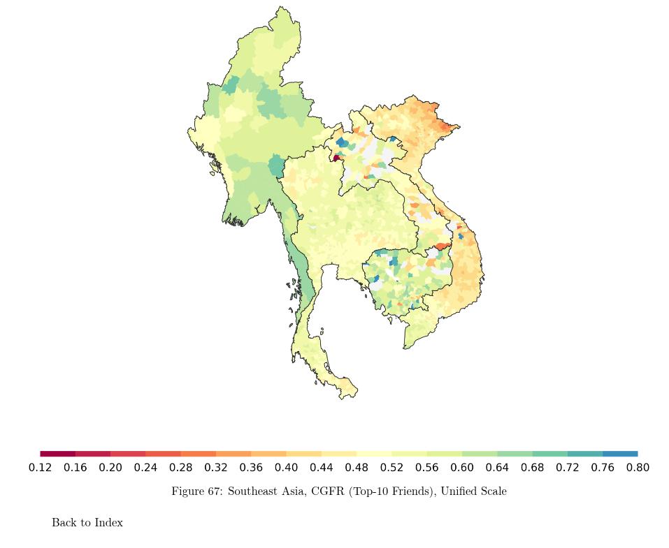
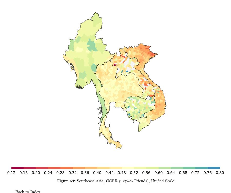
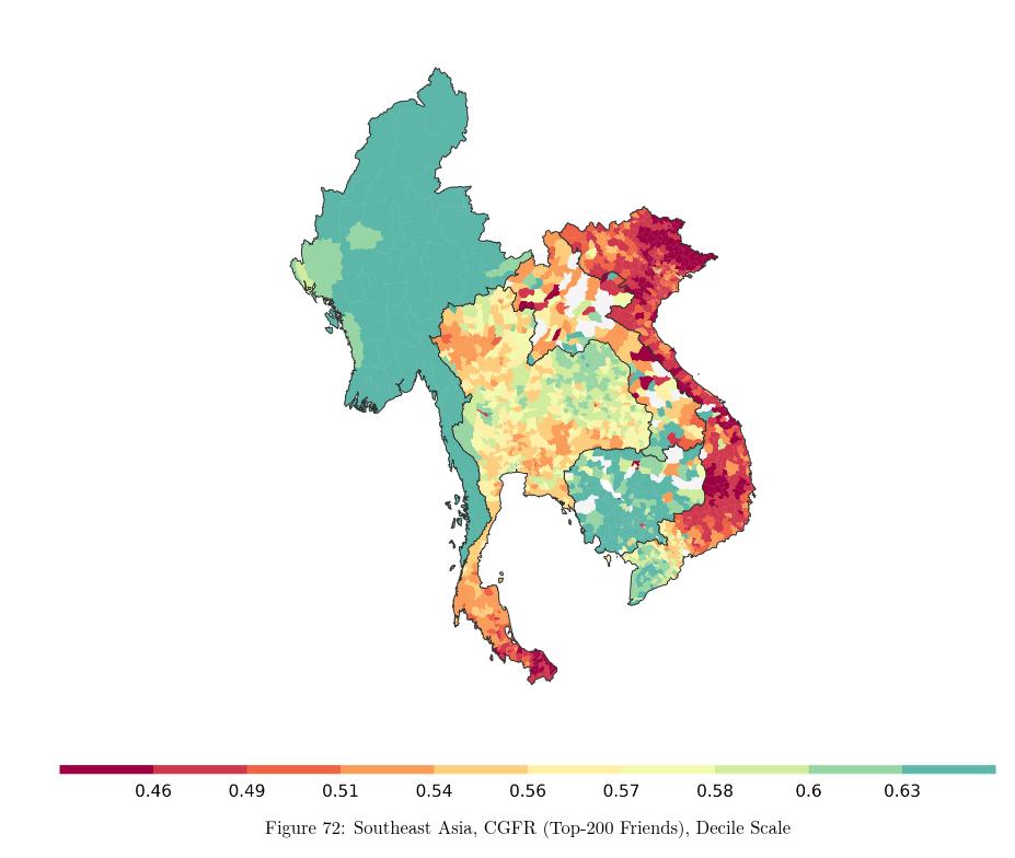
what’s going on in specifically myanmar


